CASE STUDY:
BRAND STRATEGY & IDENTITY
Role: Creative Director
Client: Mendix
Category: Enterprise AI
AI was changing how enterprises worked. Mendix was changing too, moving beyond application development to help business deploy, govern, and orchestrate AI at scale. When Mendix repositioned in early 2026, the brand needed to make that evolution clear.
I shaped the strategic story behind the Mendix repositioning, spanning messaging, tone of voice, brand personality, and the design language that brought it all to life. By uncovering the audience’s deeper emotional needs, identifying clear competitive white space, and defining brand pillars, I gave Mendix a strategic, more ownable position in the market.
THE NEW GEOGRAPHY: COMPETITOR ANALYSIS
Before looking inward, we needed to survey the lay of the land - and identify any competitive whitespace in the market.
An in-depth analysis of Mendix’s top competitors (Microsoft, Glean, Salesfroce, Databricks, Palantir) revealed four key territories to exploit:
1
“Agentic” is no longer differentiating, it’s table stakes.
To differentiate: we should stray away from the now-cliche AI motifs (sparkles, chat bubbles, bots), and lean into a more distinctive “system” aesthetic.
3
Getting AI pilot projects into production is still a struggle, even with the big names.
To differentiate: we need to reinforce that Mendix is not a “lab” or “sandbox”, but production-grade platform that ships solutions reliably.
2
Everyone we’re up against talks about AI and agents as extensions off of their main offering or main center of gravity, not as the product itself.
To differentiate: we need to signal that AI/agentic capabilities are part of our architecture, not a wrapper or bolt-on offering.
4
Highly regulated industries need to build systems that are auditable, with end-to-end traceability.
To differentiate: we need to signal this transparency with a visual language of explainability.
THE NEW GEOGRAPHY: TARGET AUDIENCE ANALYSISWith a map of the competitive landscape resolved, the next step was to understand the emotional bearing of our target audience.
Our primary target personas are senior-level enterprise decision makers, the C-suite, and IT buyers. By examining what each role was accountable for in the enterprise, surfacing their common ambitions and frustrations was easy.
1
These folks are under pressure to deliver ROI on AI, but doing so safely is a must. These personas are:
Ambitious but cautiousTransformation-oriented but politically accountableOpen to AI but burned by pilot failuresResponsible for governance, cost control, and operational continuityAbsolutely not chasing noveltyThey are trying to make the enterprise coherent
2

These personas are not buying AI, they’re buying:
CoherenceControlConfidenceTrustTransparencyExecution at scale
THE LEGS WE STAND ON: BRAND PILLARS
Brand pillars turn our research into direction. They are the backbone that ultimately guide our visual language. They had to be firmly shored up before that design language was explored.
In many ways, these pillars are the Venn diagram of the competitive white space and the emotional bearing of the target audience. Each one is carefully crafted to speak to the ambitions and frustrations of the senior enterprise decision maker, while also taking into consideration sentiments that are perhaps over-served in the market already.
Pillar 1: Built to Run the Enterprise
Mendix is positioned as enterprise-scale infrastructure, not a lightweight AI layer or sandbox. It connects systems, people, and agents to run real workflows across the business.
We’re signaling: Built for massive enterprise complexity, not isolated AI experiments.
Pillar 3: Context is the Product
The differentiator is not just models or features, but a live institutional context model of how the business actually works across systems and functions.
We’re signaling: AI has live view of the entire enterprise, not just silos.
Pillar 5: The Governed Hybrid Workforce
People and agents work together inside defined roles, policies, approvals, and escalation paths. That makes autonomy practical, not chaotic. The symmetry between humans and their AI counterparts is the crown jewel of our brand.
We’re signaling: True collaboration and symmetry between humans and AI.
Pillar 2: Governance is Power
Governance is framed as the thing that makes AI scalable, trustworthy, and usable in regulated environments, not as bureaucracy that slows things down.
We’re signaling: Control, auditability, and enforcement are what makes AI trustworthy (and only then is AI actually valuable).
Pillar 4: From Signal to Action
Mendix closes the loop from insight to execution, so AI doesn’t just recommend; it acts through workflows and business processes. Said differently, if your AI only makes recommendations, it’s incomplete.
We’re signaling: Not just dashboards or recommendations, but actual execution.
THE EMOTIONAL TERRITORY MENDIX MUST OWN
Engineered, not experimental.
Governed, not chaotic.
Enterprise-wide, not function bound.
Execution-native, not dashboard-first.
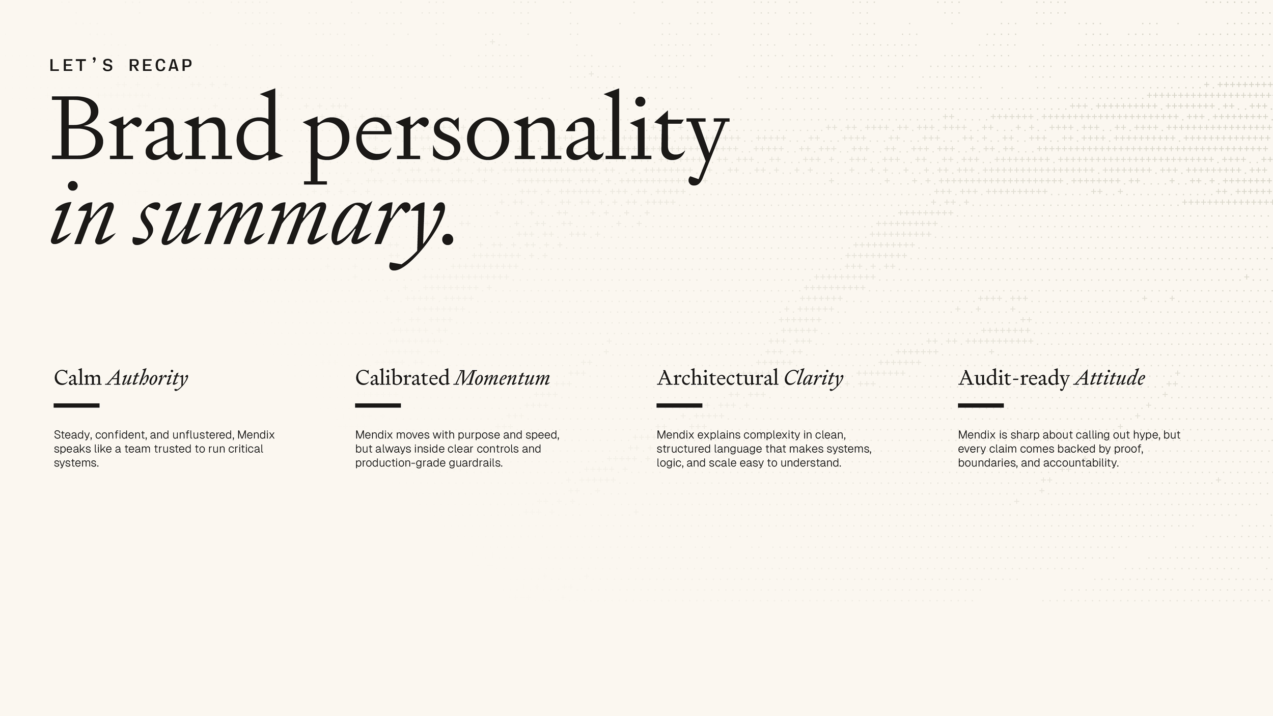
OUR BRAND PERSONALITYThe next step was to craft a brand personality that would give Mendix a clear and strategic way to posture itself among it’s competitors. The right personality helps the brand feel more distinct while resonating more strongly with the intended audience.
These personality traits ultimately informed the visual territory Mendix would exist in. Informed by the newly-constructed brand pillars, they were optimized to resonate with our intended target: the senior enterprise decision makers.
1. Calm Authority
Mendix sounds steady, certain, and unshakable. Our work speaks for itself, so we steer clear of hype language. We speak of what is true, and what is possible - no fluff.
We do use confident, declarative sentences.
We do not use breathless hype.
We never imply anything we do is "magic".
3. Architectural Clarity
We simplify complexity. We explain complex systems in clear, structured terms - no fluff, just plain logic. This direct way of communicating is appreciated by the CTO as much as the developers working with the product.
We do prefer specifics over abstractions.
We do not use foggy “empowerment” language.
We never use jargon.
2. Calibrated Momentum
This is how we talk about speed to executives without signaling recklessness. Yes, we are fast, but in a very controlled way. This is the antithesis of start-up language hyping up speed and fast delivery times. Think “trained jet pilot speed, not high-schooler-in-a-corvette speed.”
We do use production verbs like "run, deploy, scale."
We do not use hustle vibes like "relentless" or "crush".
We never talk about 10x-ing speed.
4. Audit-ready Attitude
This is our license to be confident and irreverent, because we have the receipts to back up everything we say. We welcome scrutiny, secure in the efficacy of our offerings. We walk the walk, so we can (and do) talk the talk.
We do use dry, grown-up humor aimed at category dysfunction.
We do not use slang, memes, or internet voice.
We always write like the CTO and Dev leader are reading.
OUR BRAND PERSONALITY IN ONCE SENTENCE
Mendix sounds calm, clear, and confidently unrattled. We speak in clear, structured terms, move forward with control, and cut through hype with a quiet smirk.
IMPLICATIONS FOR DESIGNEvery decision we’ve made so far must be clearly signaled through a visual system. It must articulate that Mendix is engineered, governed, coherent, and quietly powerful–not shiny, playful, or slick.
We only have five levers to pull in order to achieve this: color, type, layout, motion, and visual motifs. Each one must be pulled carefully and deliberately. Before we dive into nitty-gritty detail, here are the broad-strokes we will cover.
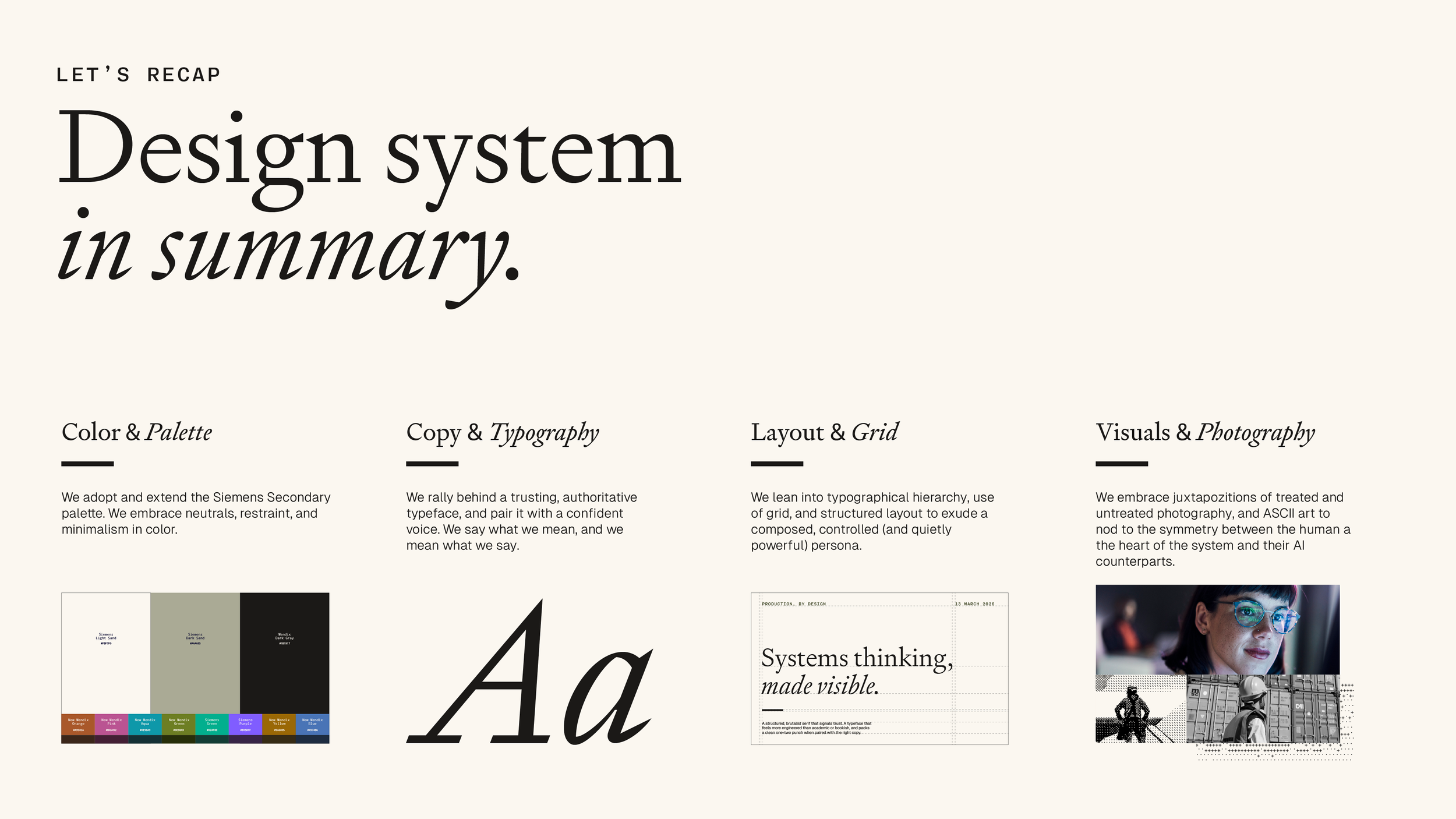
Palette
Perhaps the only guardrail provided by the CMO when this project was briefed was that color should feel cohesive with the parent company’s palette. Lucky for us, the Siemens primary and secondary palettes were robust.
Layout
To appear highly governed and engineered, we need structure in spades. Every asset we produce, whether it’s a long-form web page or an A5 print piece, must be grid first, grid heavy, and modular.
Visual Motifs
Illustrations are the cousin of fluff, so we will lean into industry-relevant photography (both treated and untreated). Those juxtapositions will signal the symmetry between humans and AI we identified in our brand pillars.
Typography
If our brand has grown up, our flagship typeface needs to grow up as well. We need a typeface that signals trust and authority. As we lean away from fluffy illustration, we will be leaning more on type to do the heavy lifting.
Motion
It’s very easy for motion to signal a certain playfulness, and we need to avoid that at all costs. No flash, no whimsy. Mendix’s new take on motion must feel direct and intentional: things snapping into their rightful place.
IMPLICATIONS FOR DESIGN: PALETTEPalette
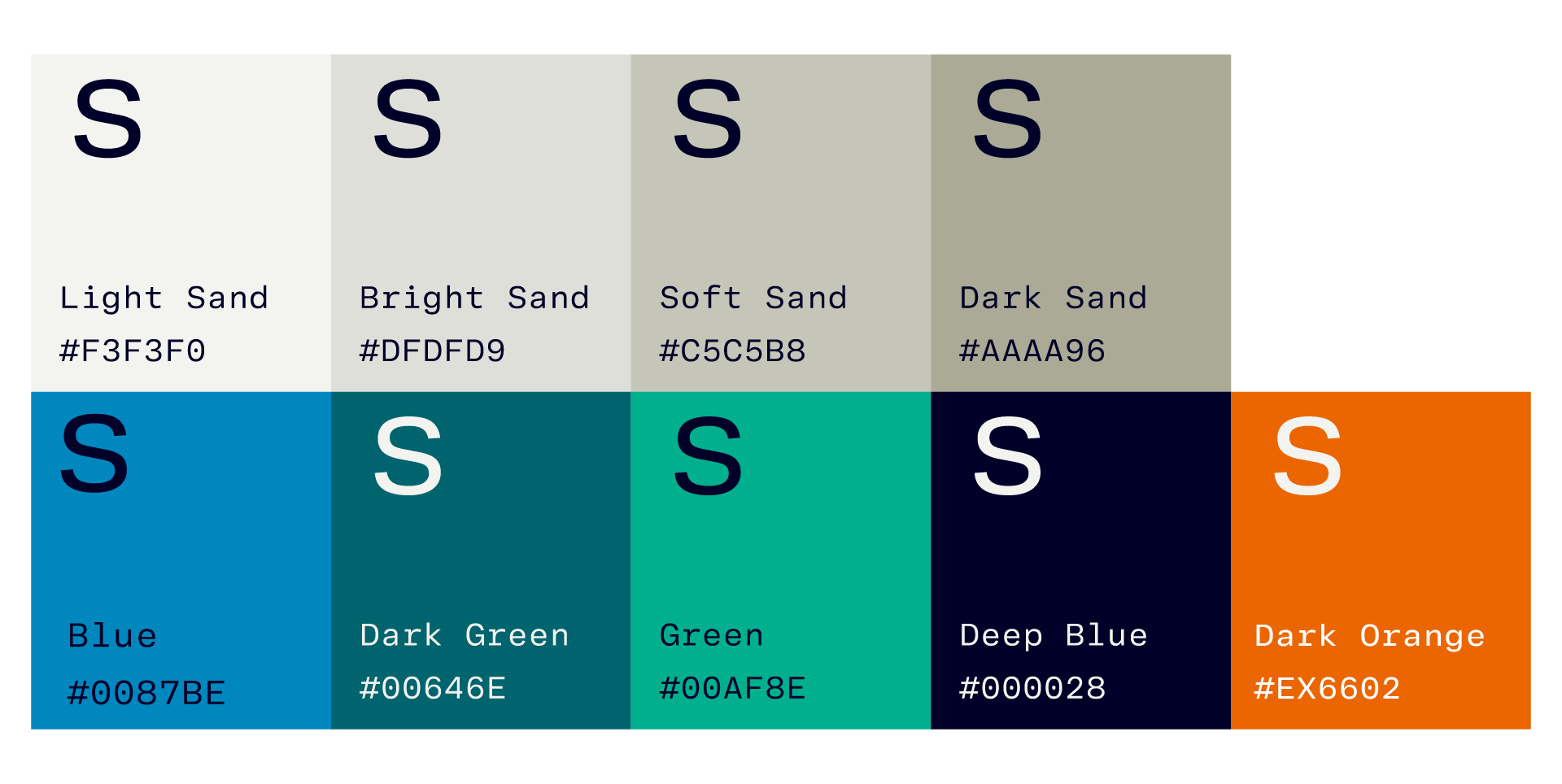
We found the Siemens primary palette to be redundant, and somewhat fussy. When we looked at their secondary palette, some doors started to open. The sandy neutrals, with a select few earthy counterparts felt like the right way to signal the brand personality, with the added bonus of being atypical coloring for AI/tech-related brands.
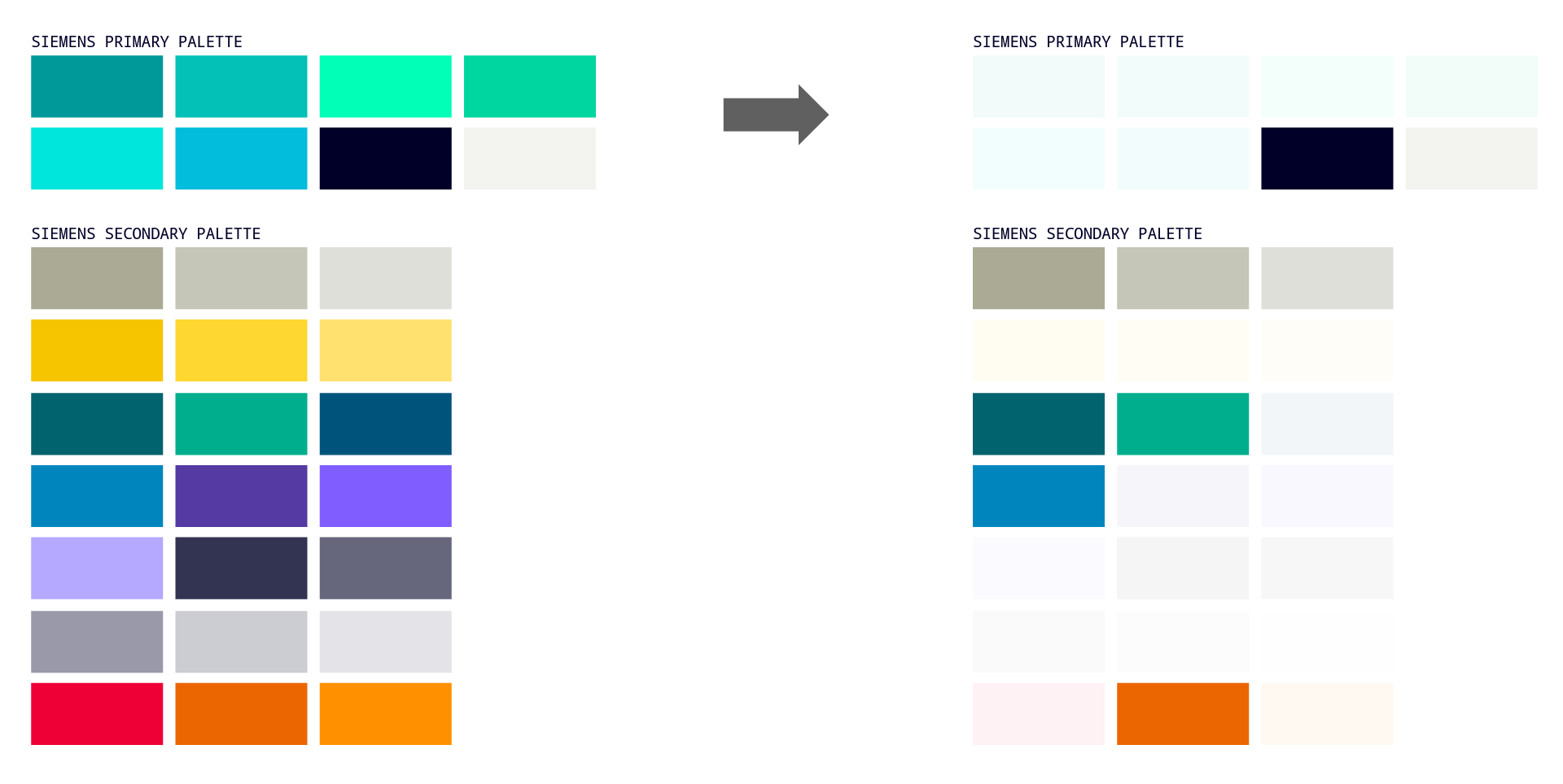
A potent way to exude confidence is through understatement. Leaning into our neutrals with occasional (and intentional) moments of color will give us that level of understatement. This is doubly-potent in an industry saturated with dark mode palettes and bright, vibrant “more is more” palettes.
IMPLICATIONS FOR DESIGN: PALETTETypography
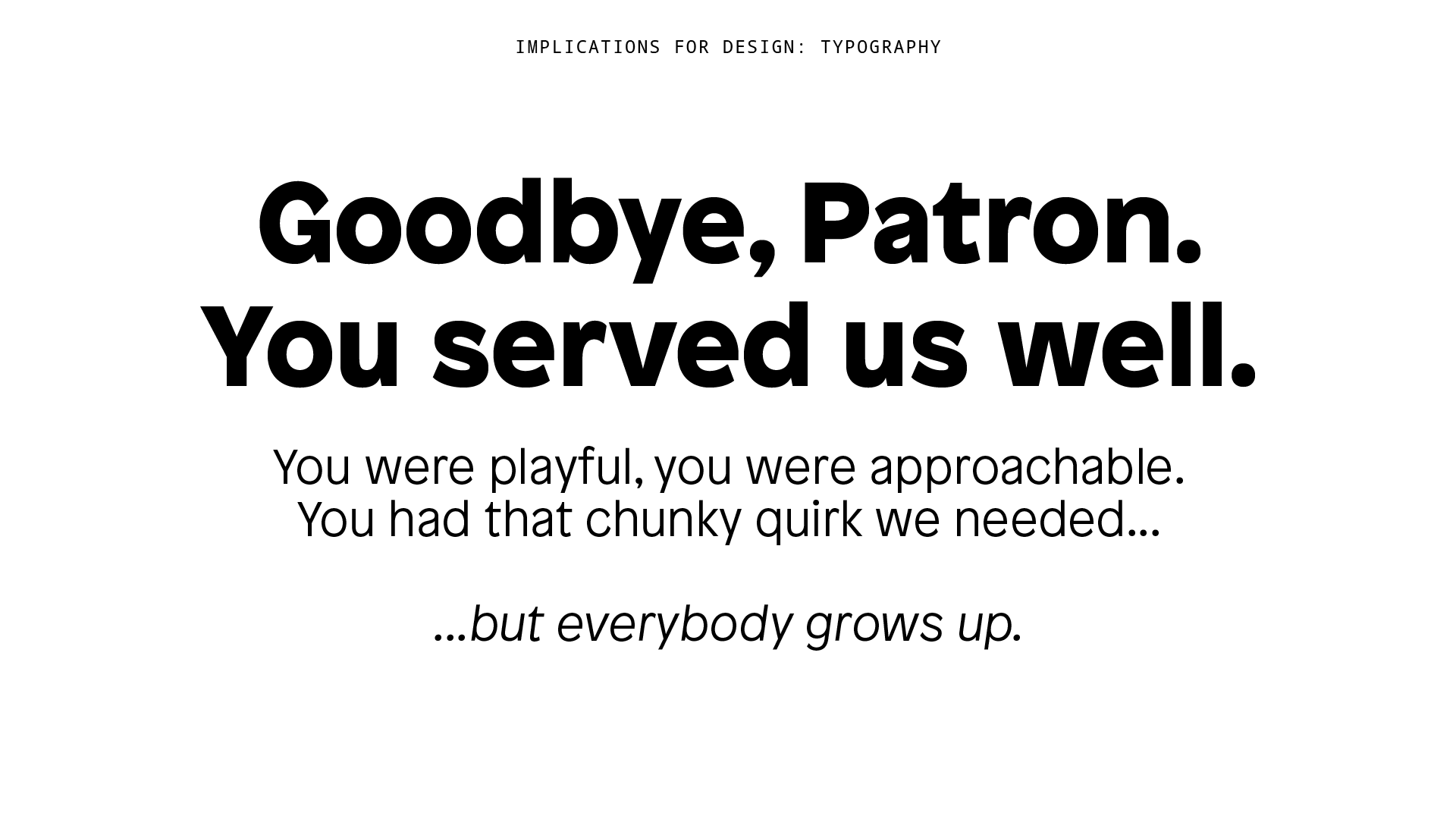
Our original flagship typeface, Patron, gave us a certain friendliness our brand needed at the time (2018). The platform was powerful, but not very approachable. Using Patron helped us offset that experience for the user.
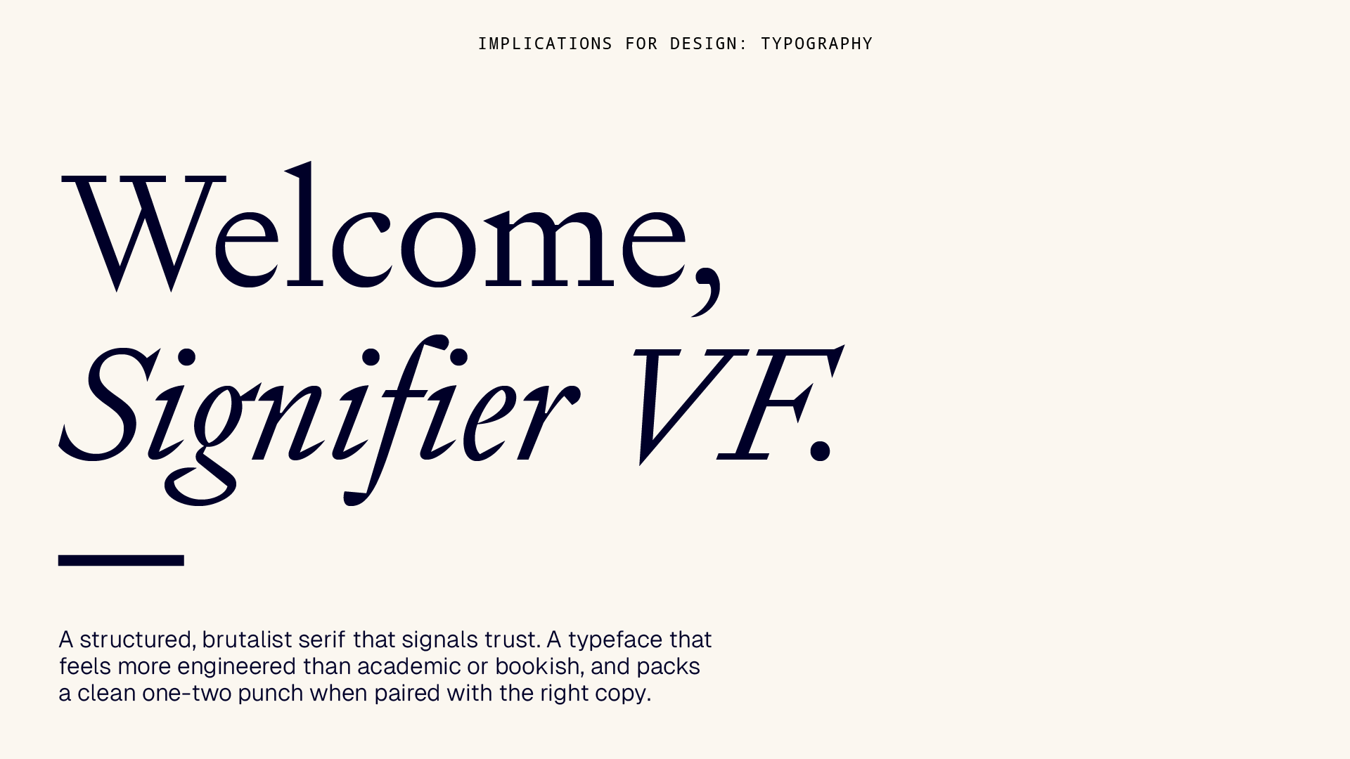
With approachability no longer our priority, we needed to go a completely different direction. We needed a typeface to feel trusting, but modern - what we needed was a serif.
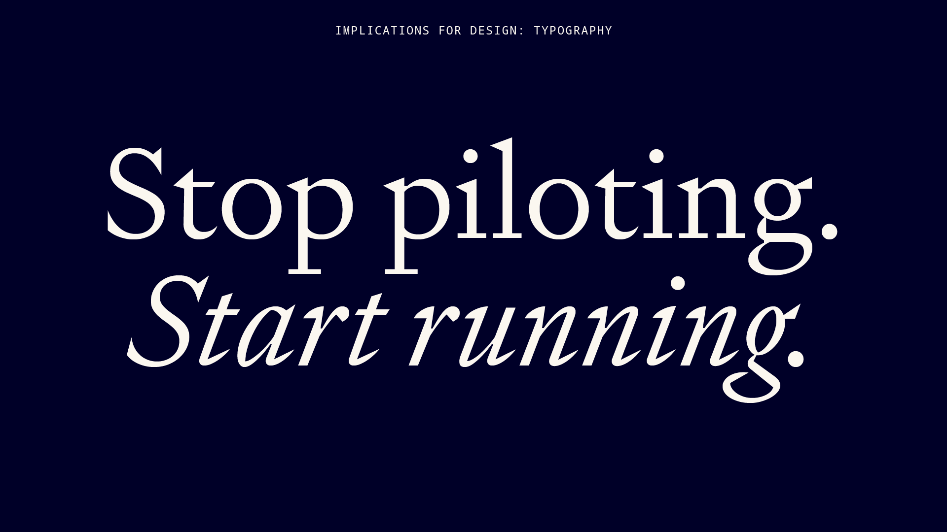
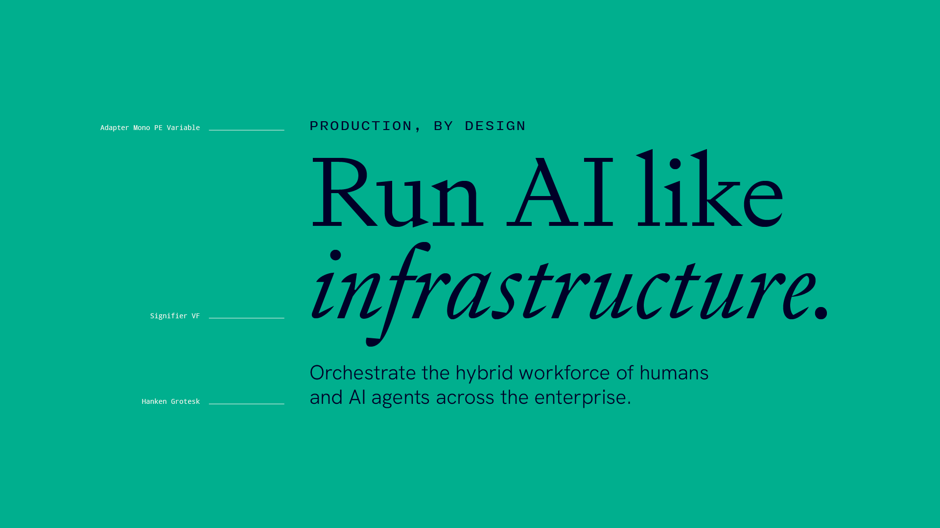
The challenge was finding a serif that felt engineered, not academic. We found our solution in Signifier VF. When paired with the right copy (and the italic weight), certain lines really packed a one-two punch.
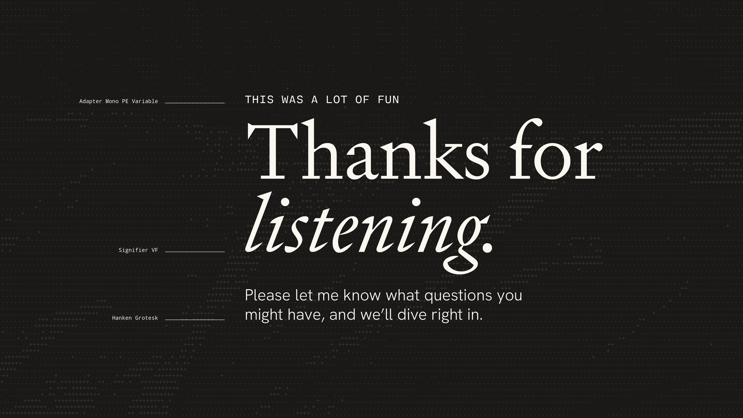
To round out our type system, we paired it with a monospaced type (Adapter Mono PE Variable), and a sans serif for body copy (Hanken Grotesk). Hanken’s roundness gave it a certain warmth that contrasted Signifier’s sharpness.
IMPLICATIONS FOR DESIGN: VISUAL MOTIFSPhotography & Bitmap
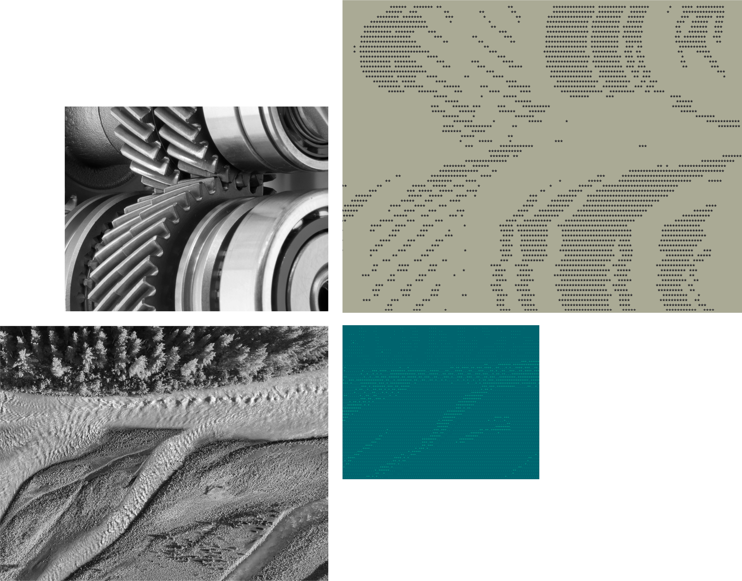
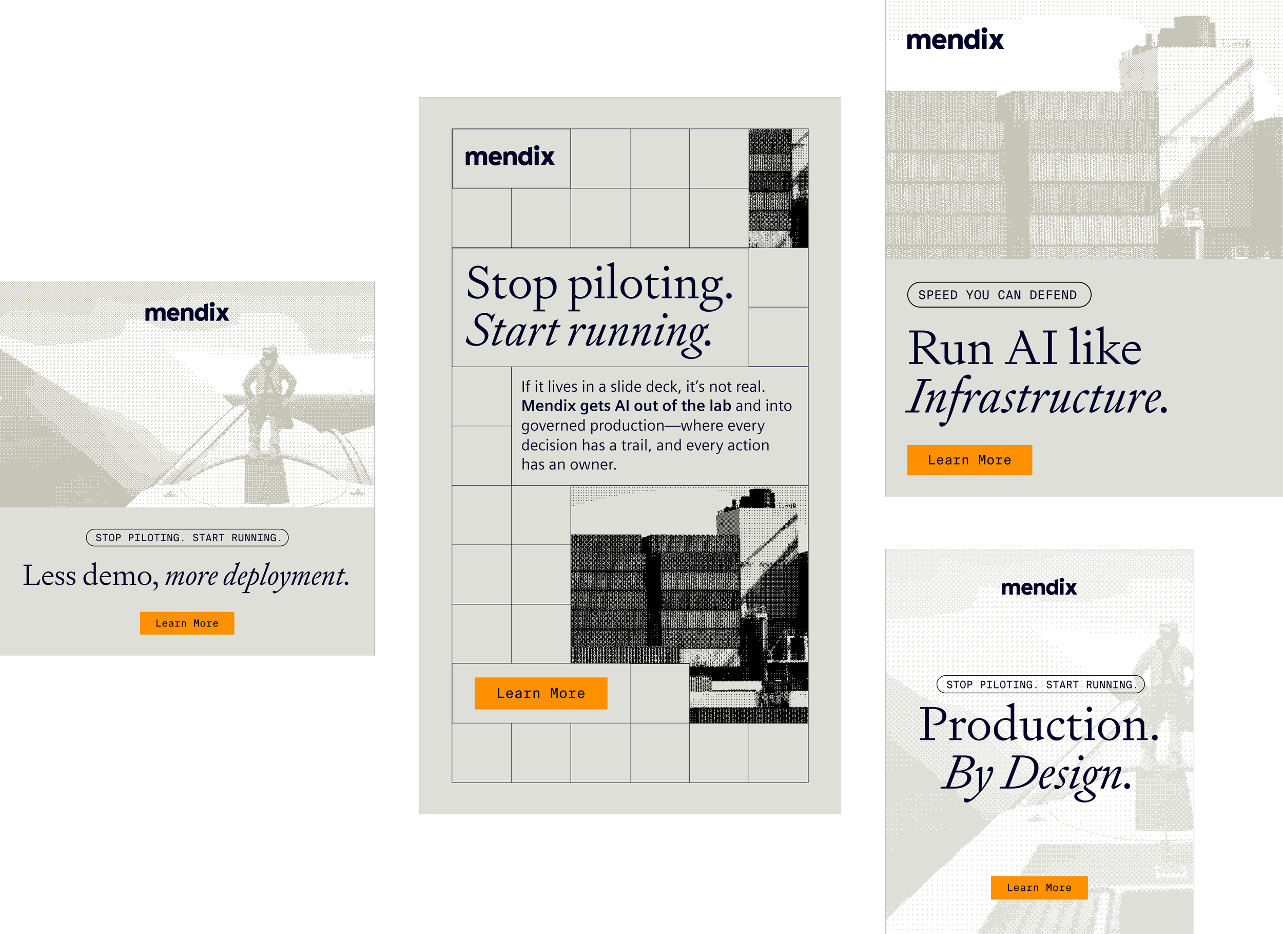
We nod to the symmetry between humans and AI systems through photography.
People and agents working together, solving mission-critical challenges in real-world applications, is what Mendix is all about. To speak to that symmetry, we will juxtapose industry-relevant photography against ‘'machined’ bitmap interpretations of those same photographs. This is how we speak to the coordination and interaction between the humans and agents in our hybrid workforce.
IMPLICATIONS FOR DESIGN: VISUAL MOTIFSPeople: The Quiet Heroes
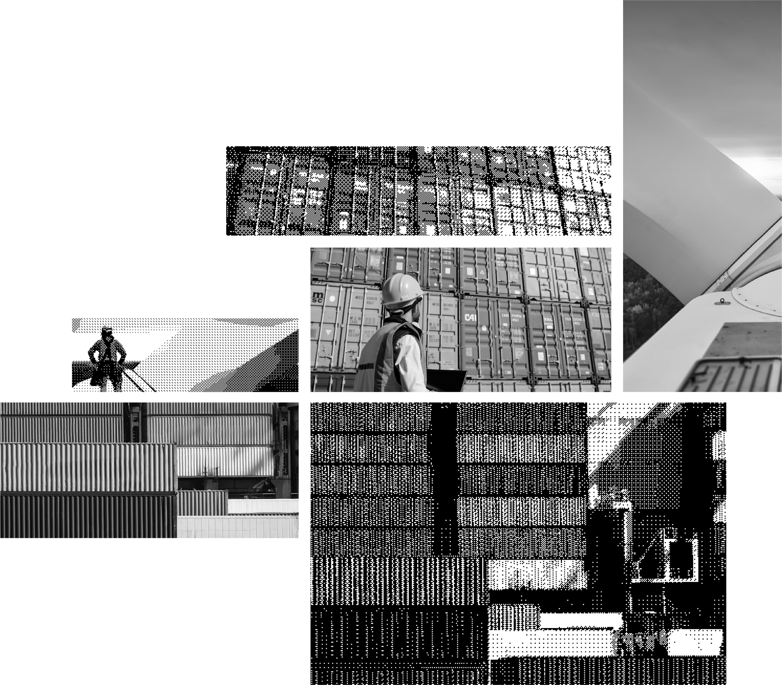
We nod to the symmetry between humans and AI systems through photography.
Human-focused photography matters because Mendix isn’t selling AI without people. We are selling governed collaboration between people and agents, so human-focused imagery makes the promise visible by showing the expertise at the heart of the system.
(As a bonus, the data from our LinkedIn rep shows this type of imagery performs particularly well in digital ad space)
IMPLICATIONS FOR DESIGN: VISUAL MOTIFSAbstraction & ASCII
We signal mechanism over magic, and structure over decoration with ASCII treatments.
Created by characters, grids, relationships, and logic, these treatments nod to the brand’s emphasis on systems-thinking made visible. These treatments are also a nod to the hybrid workforce symmetry, though a more subtle one.
We like using an old-school image treatment like ASCII for a very new-school technology like AI - that juxtaposition feels off the beaten path in the current AI climate.

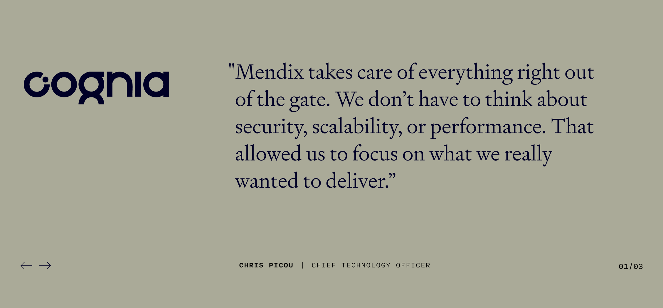
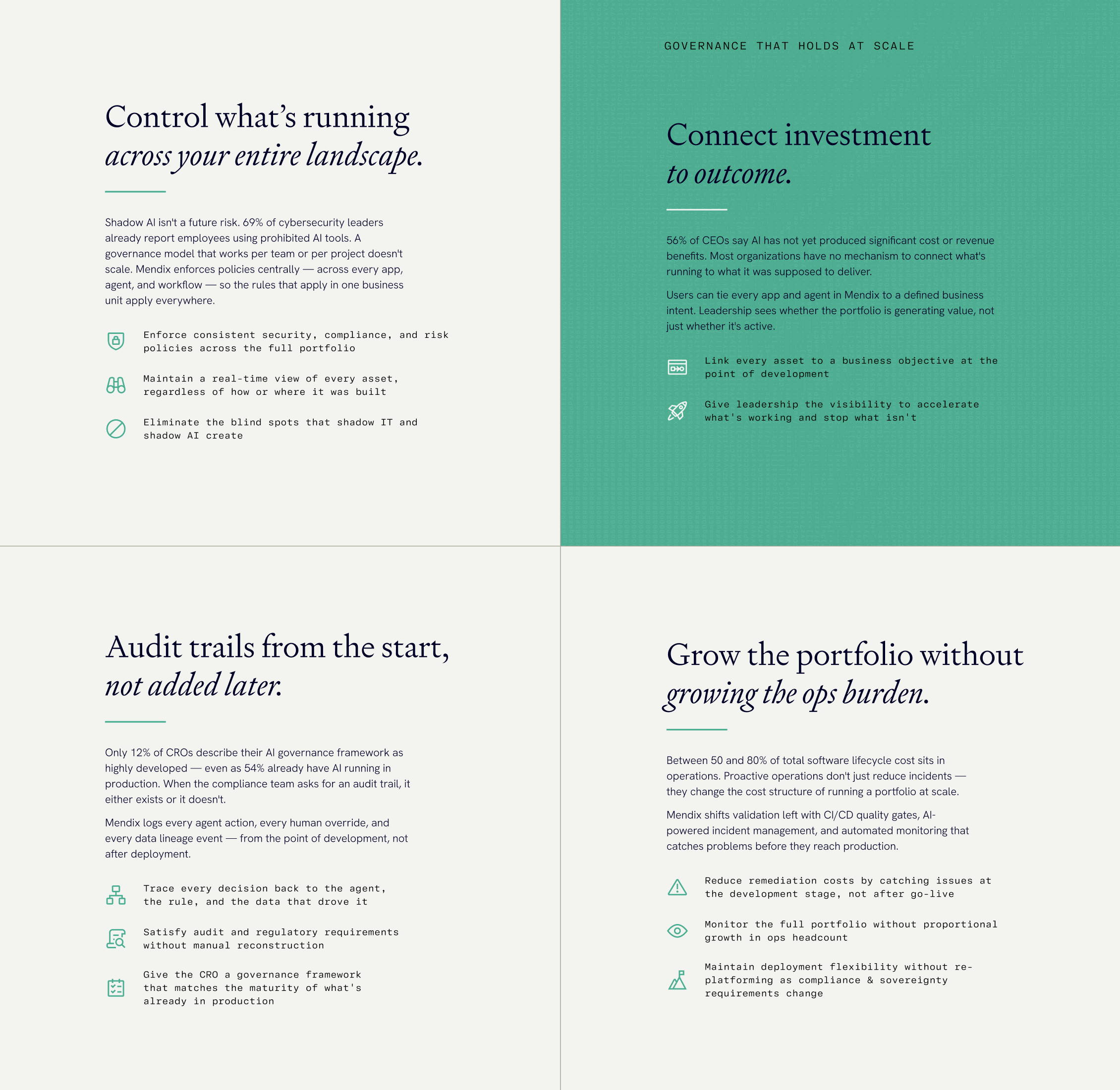
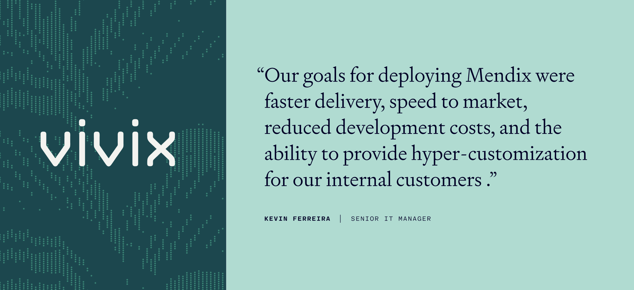

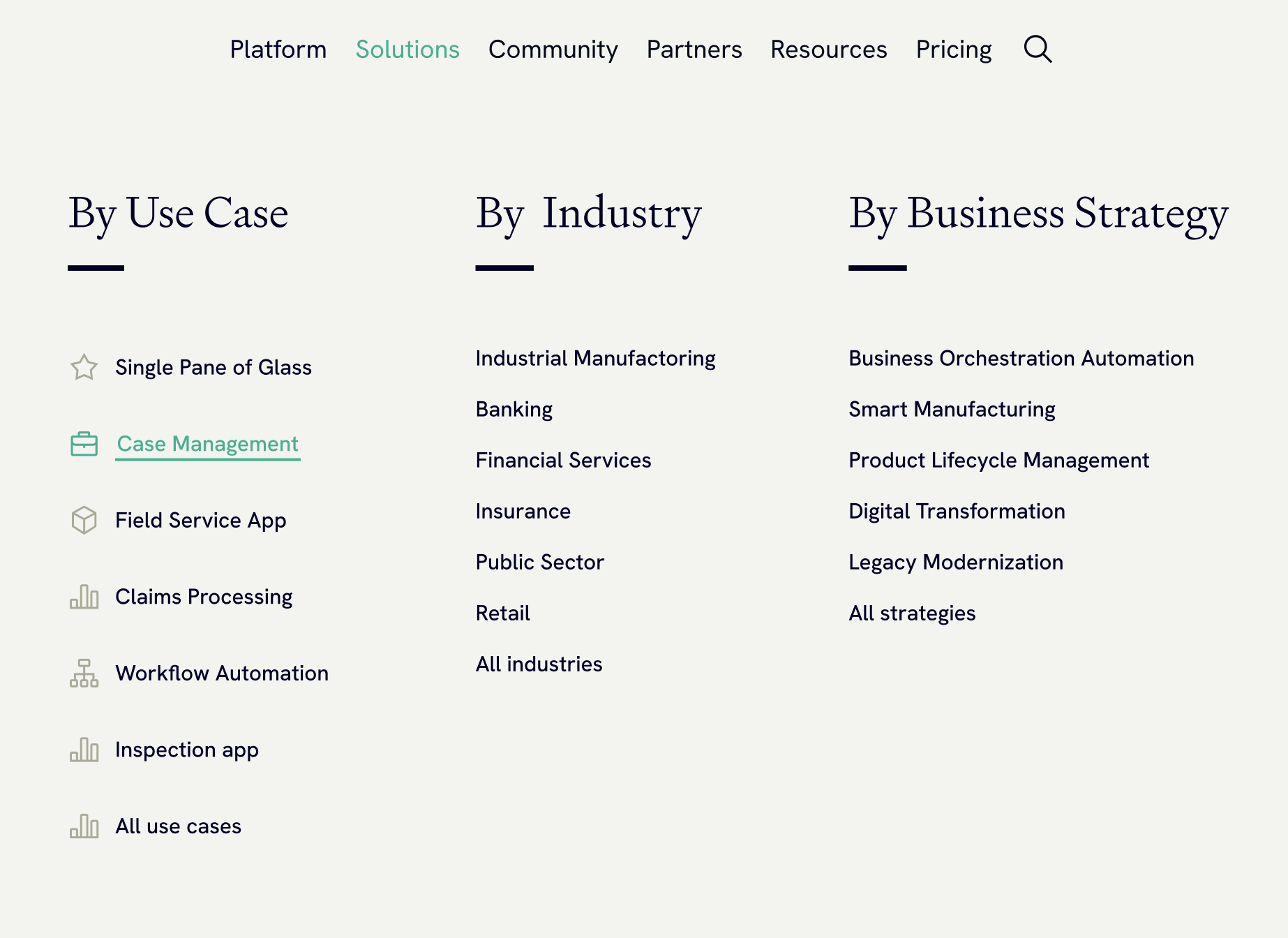

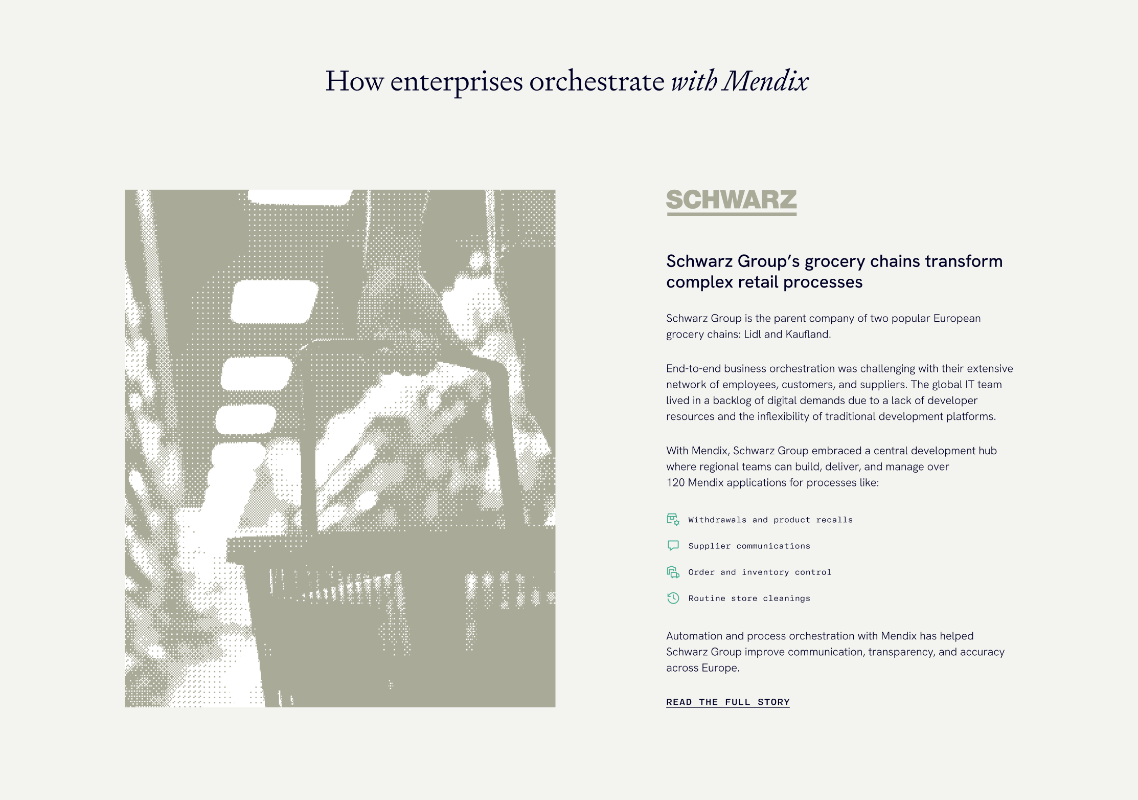
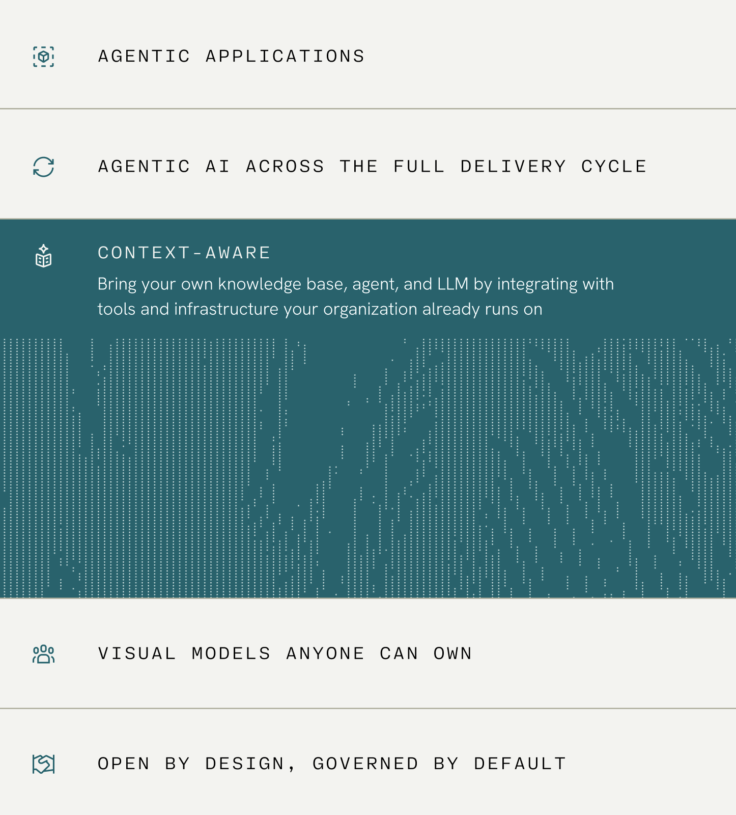


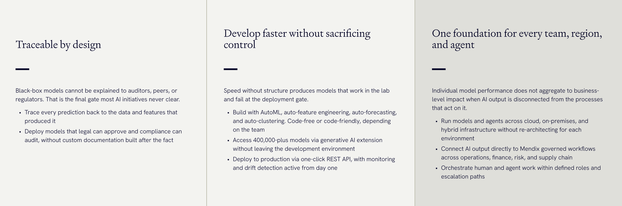
DESIGN IN ACTION: WEB PRESENCEOur new position (and therefore new design sensibility) required us to show up in a completely new way digitally. The website couldn’t just wear the new identity, it had to express the thinking behind it. We rebuilt the entire experience around clarity, structure, and restraint.
Once we established our new design toolkit, we jumped directly into developing new UI patterns. As we explored, we kept one mantra in mind: engineered, coherent, and quietly powerful. When the result landed somewhere between annual report and engineering review, we knew we were onto something: we had the structure to handle complexity, and the restraint to exude confidence (the antithesis of hype).
DESIGN IN ACTION: DIGITAL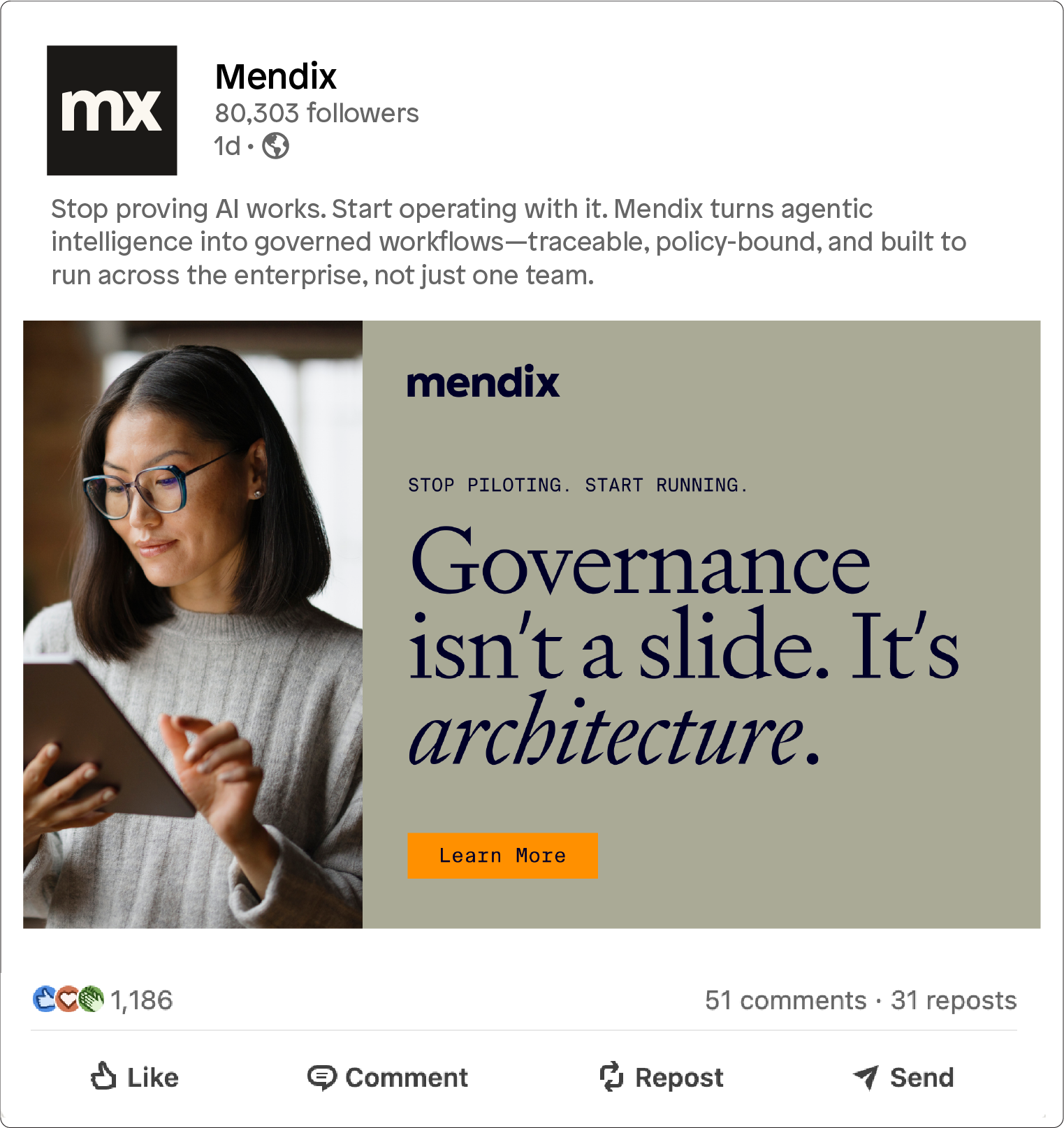
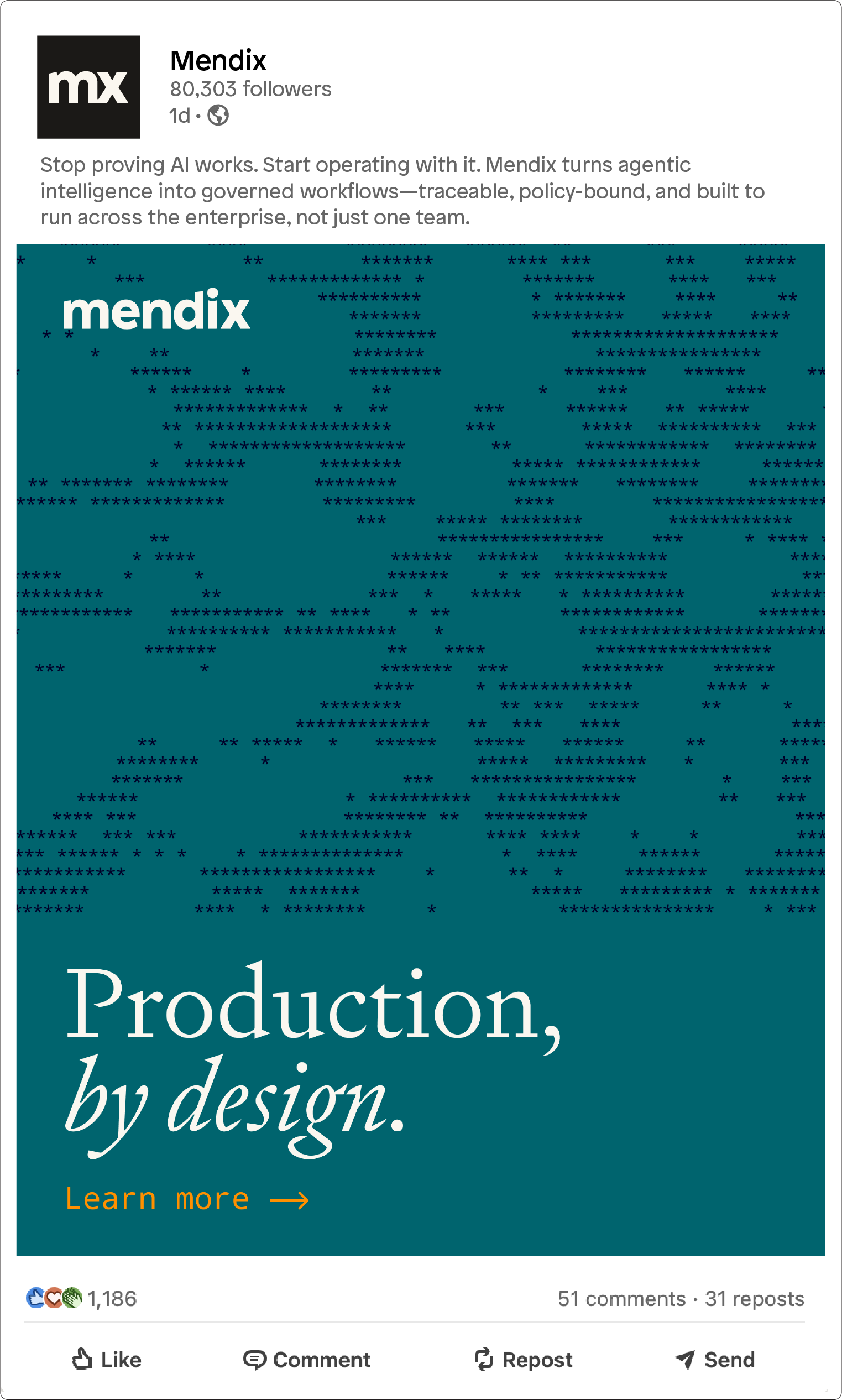
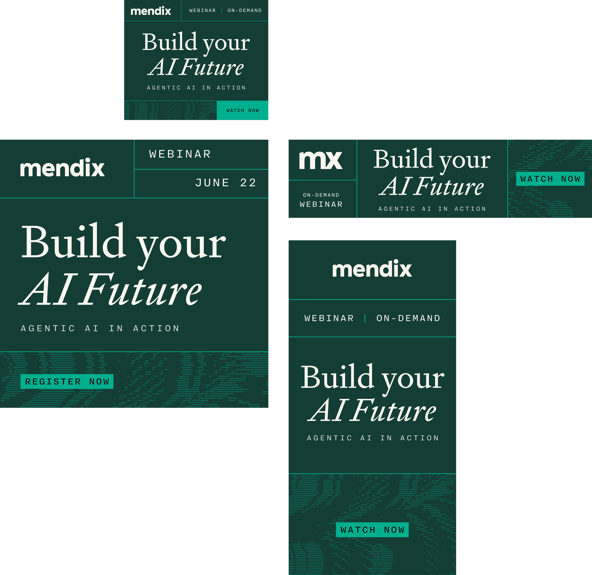
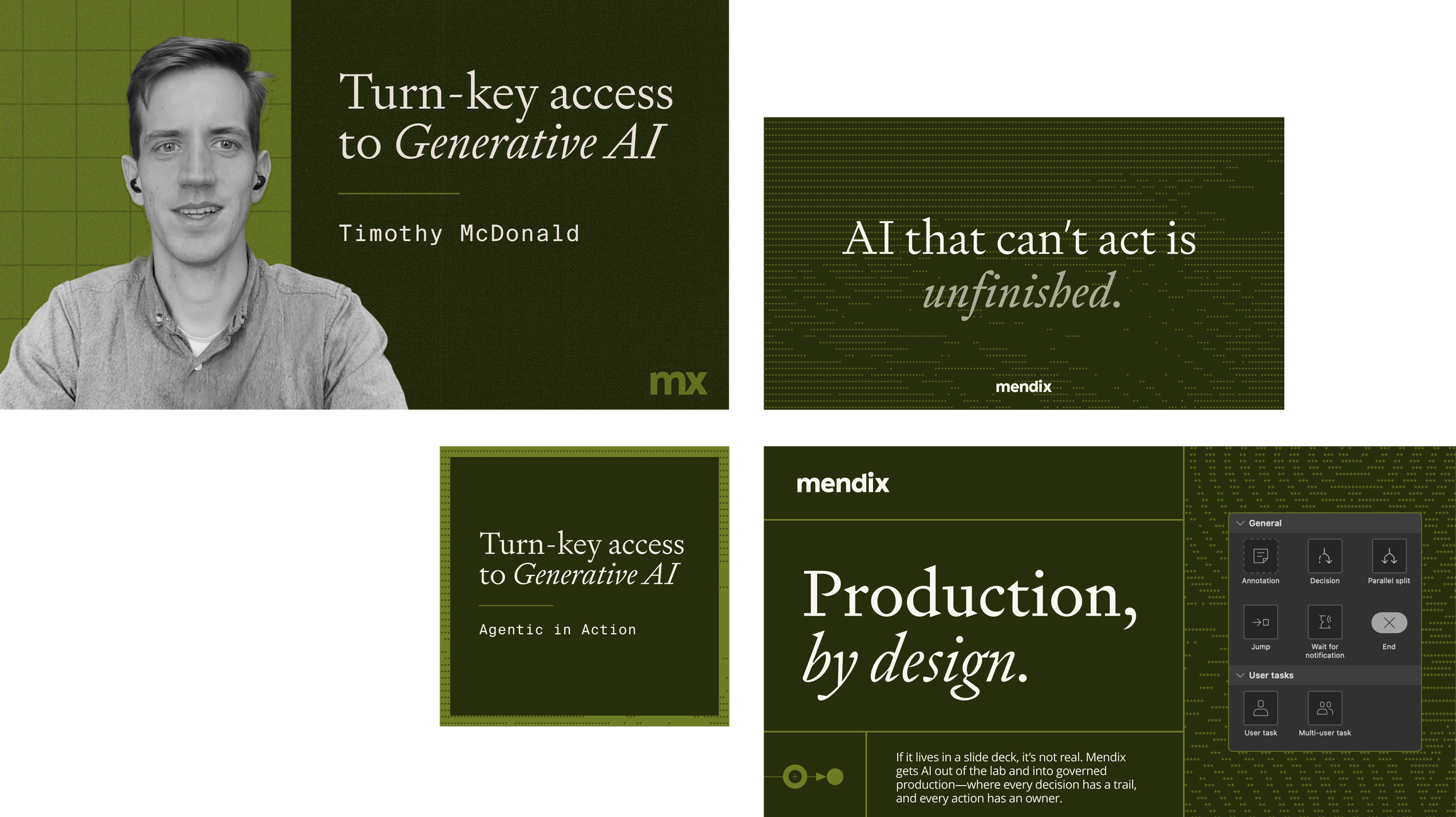
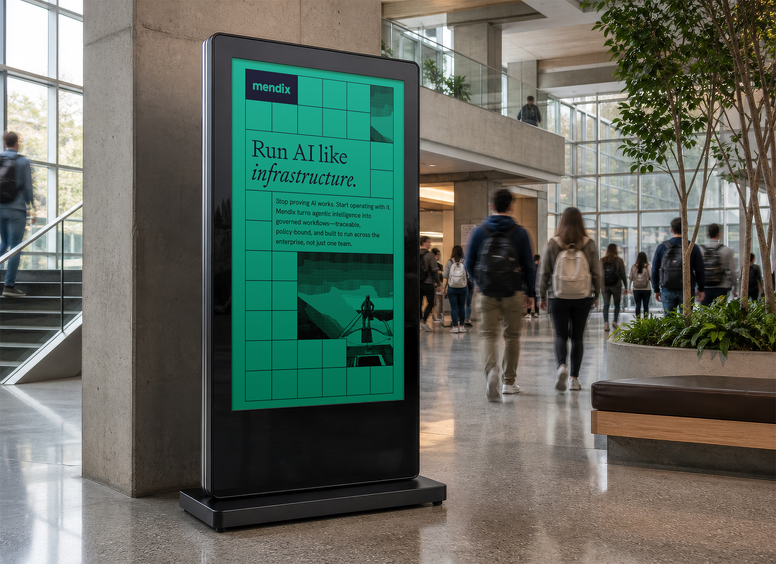
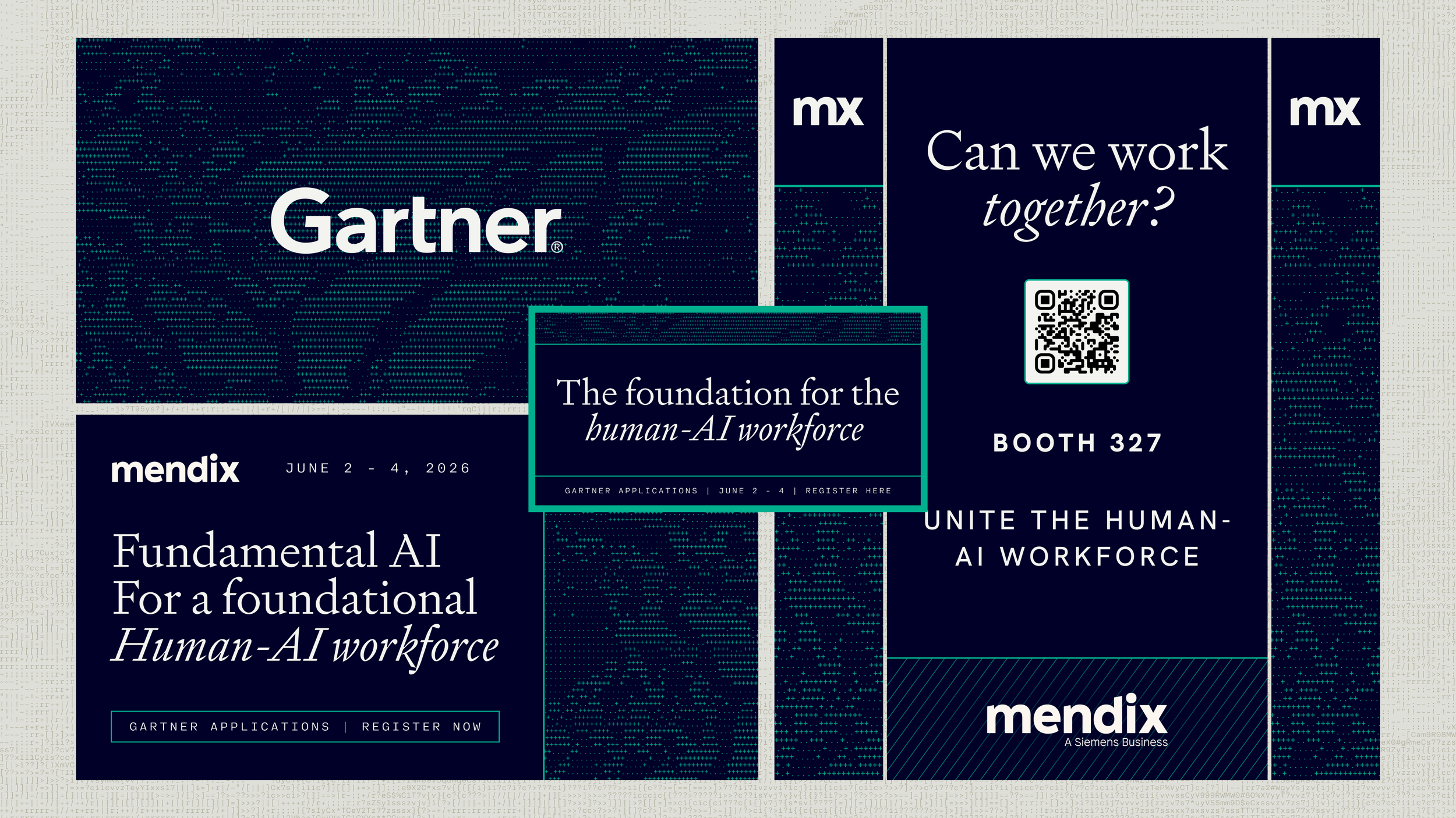
Digital ad space was our next solve. This is where our system would need to flex its variability in order to keep pace with Mendix’s high-tempo marketing engine. Below are just a few examples of the different ways our system could present itself.
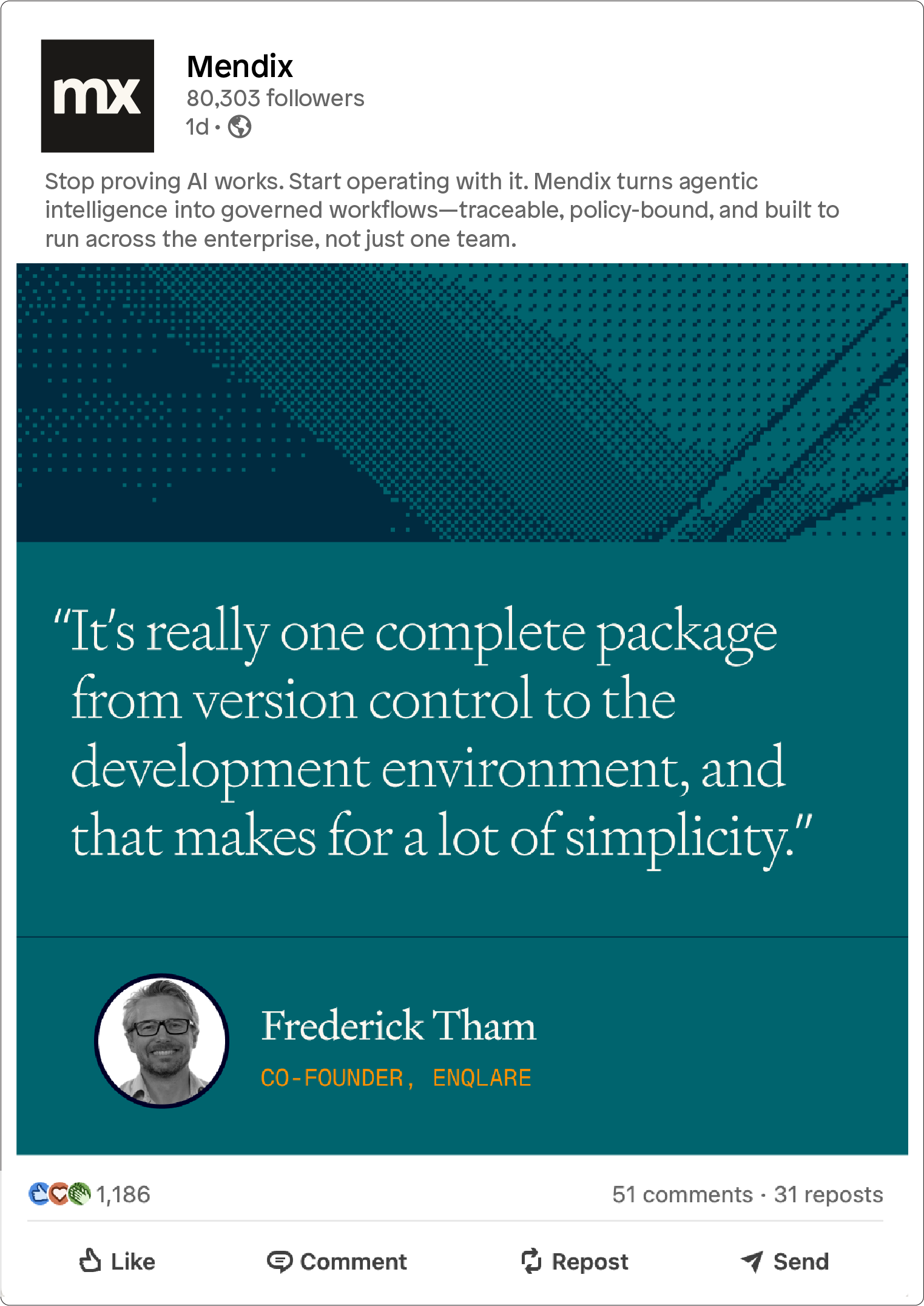
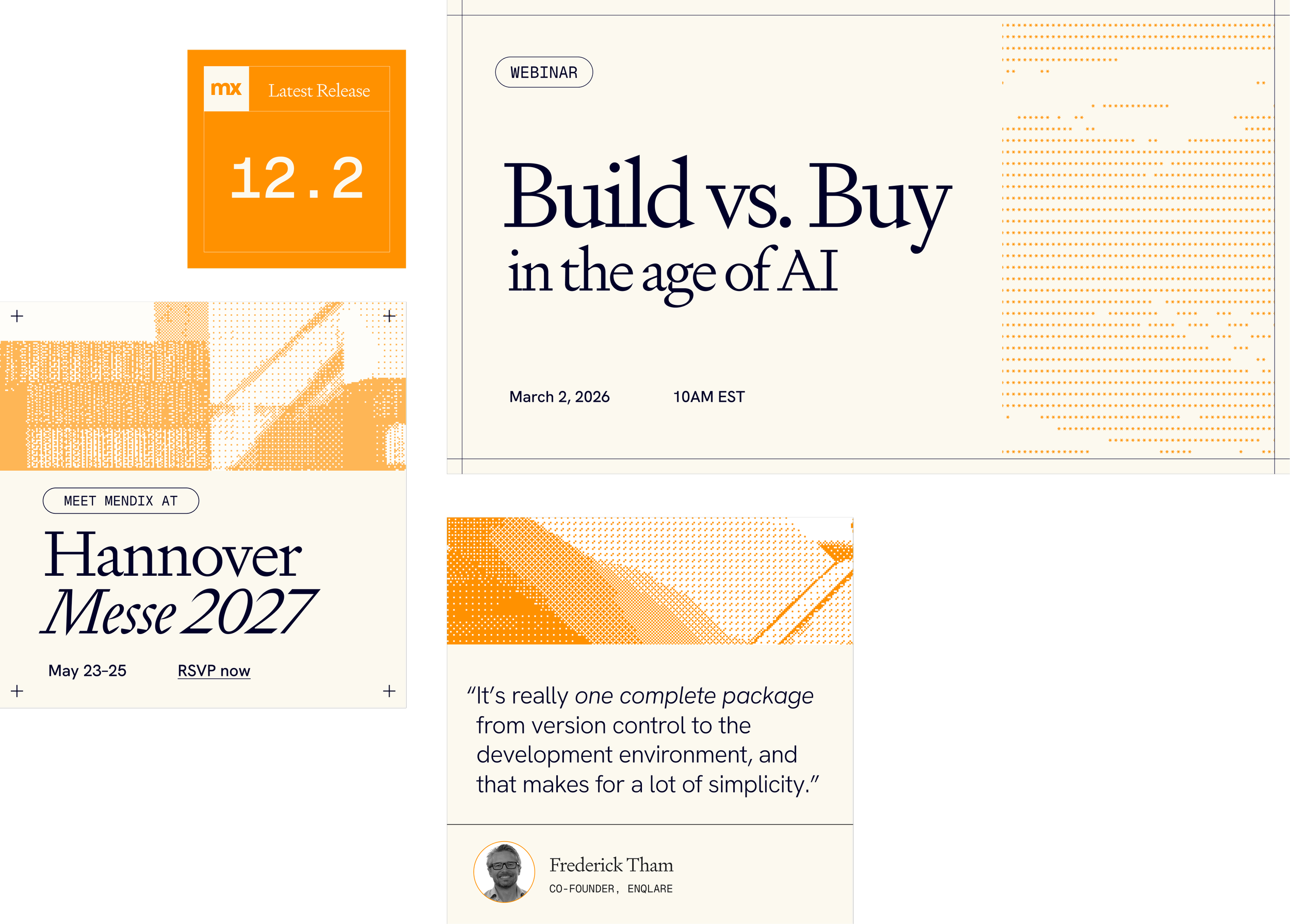

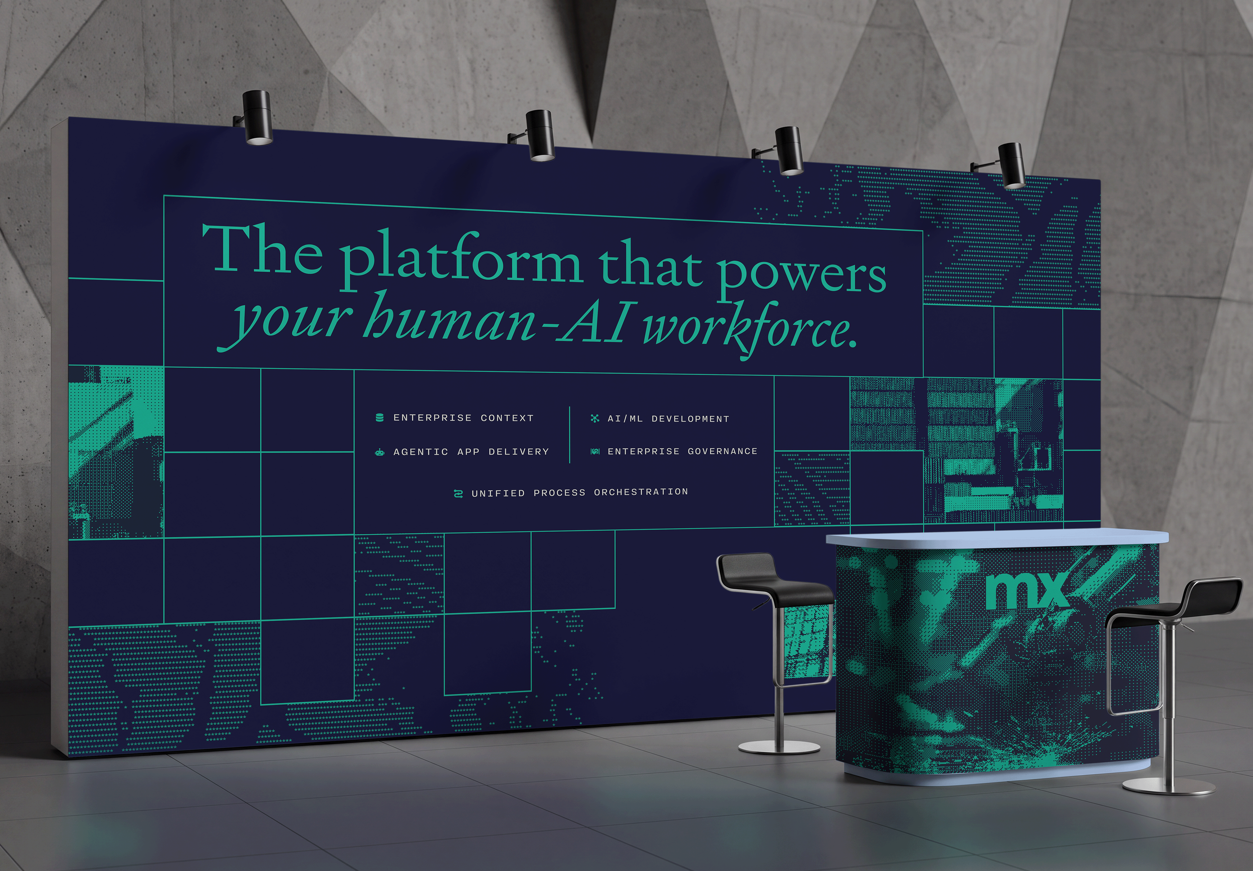
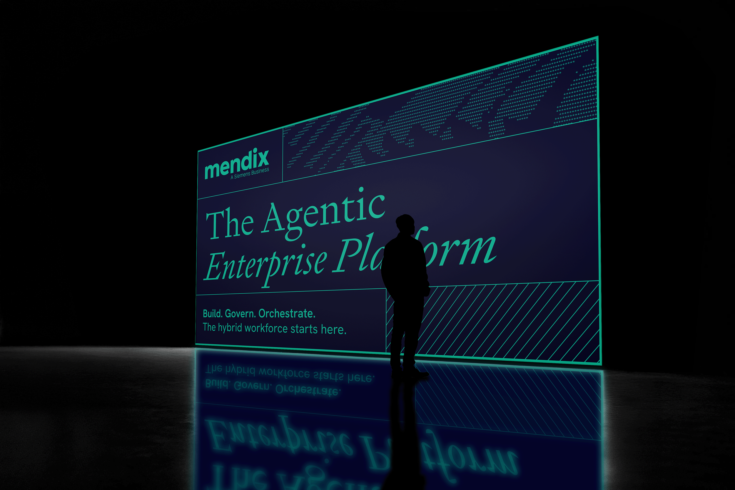
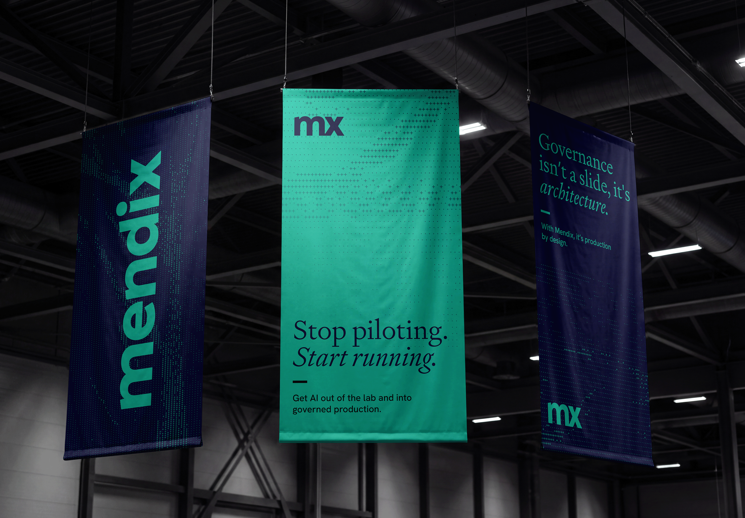
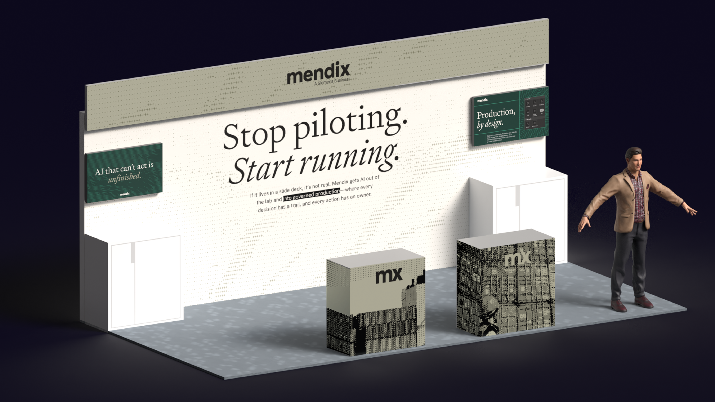
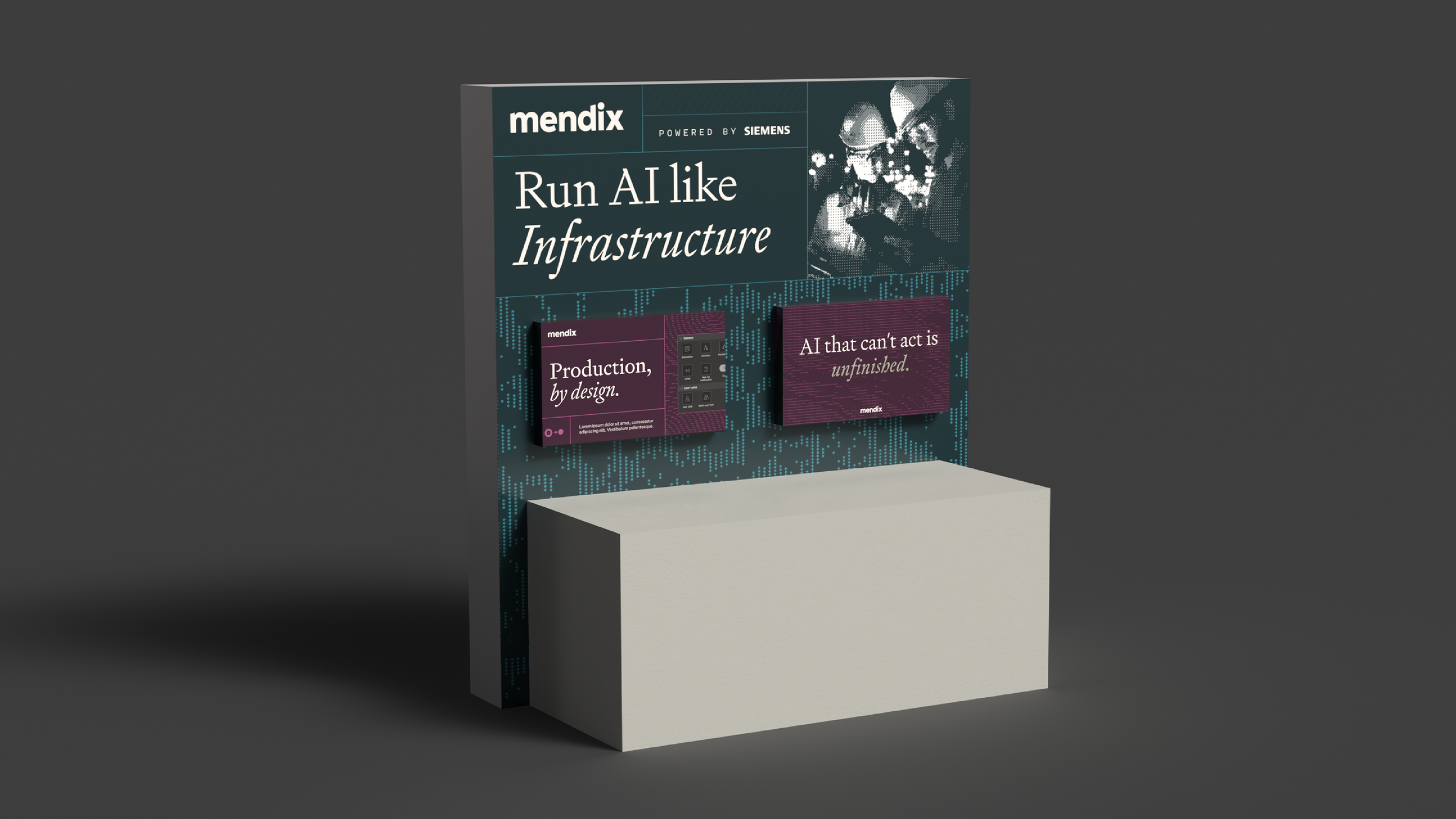
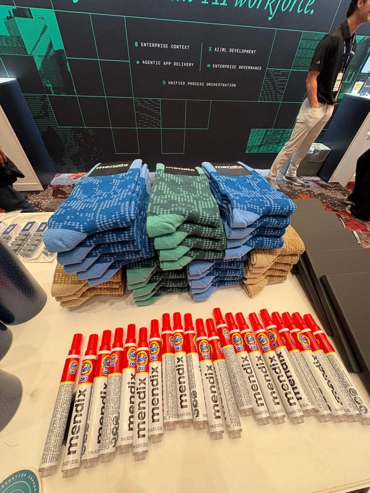
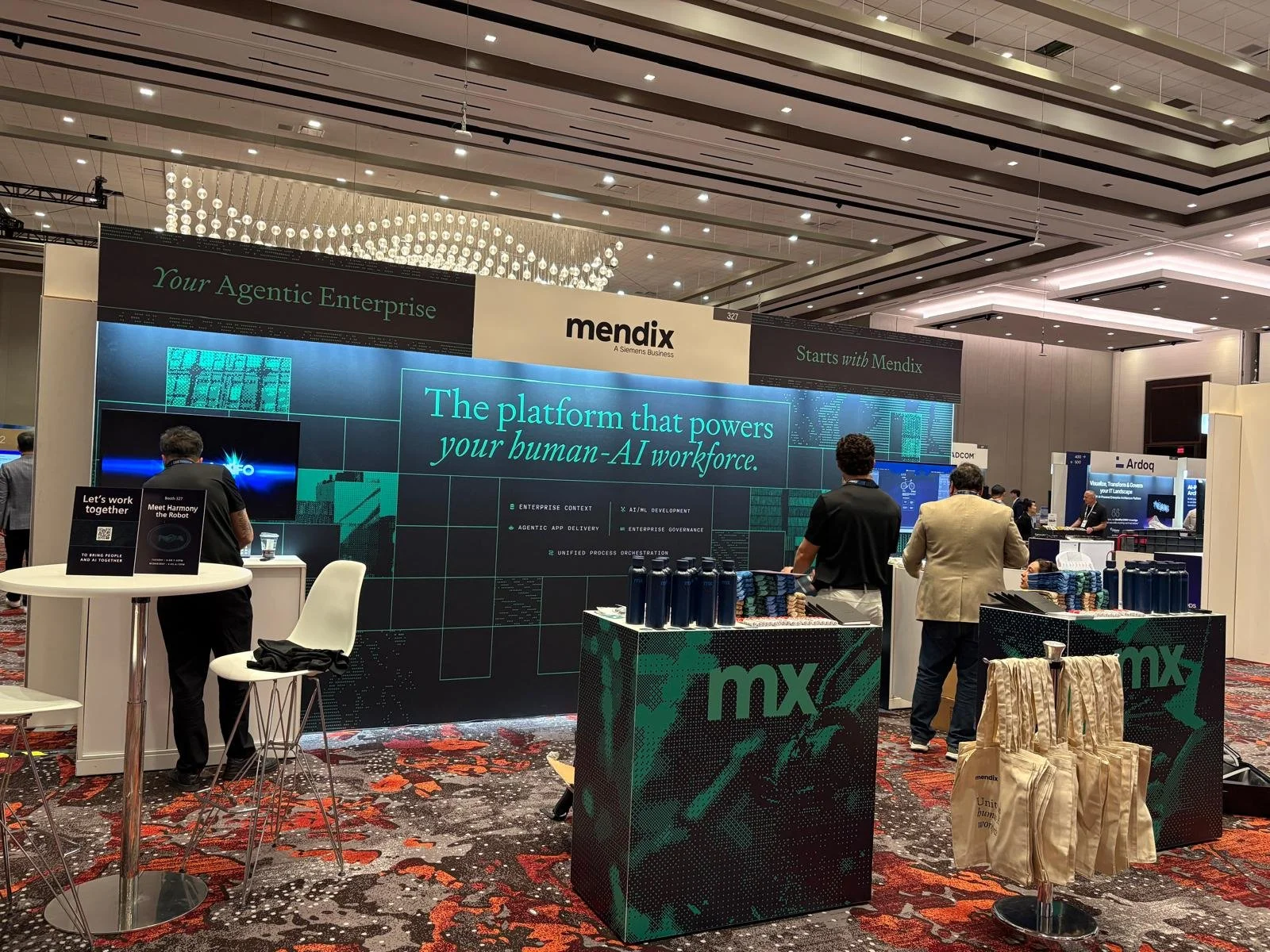
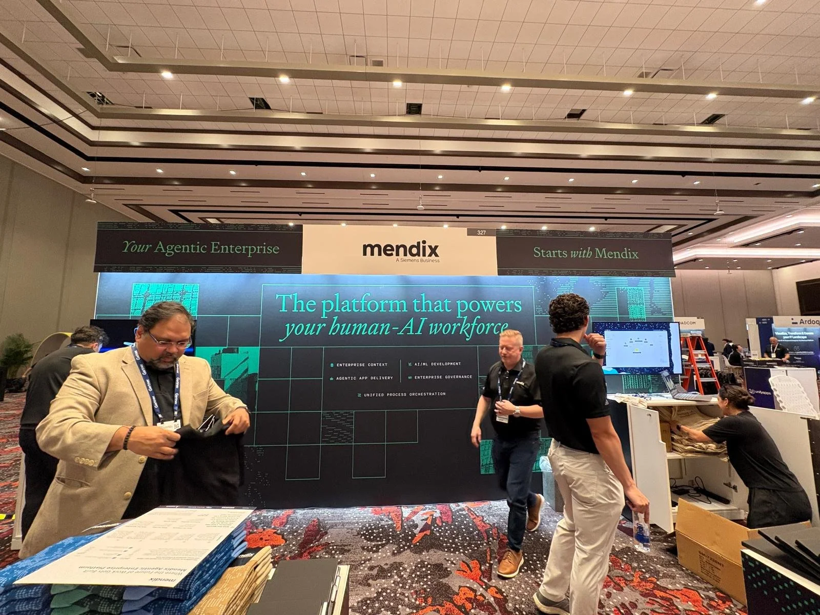
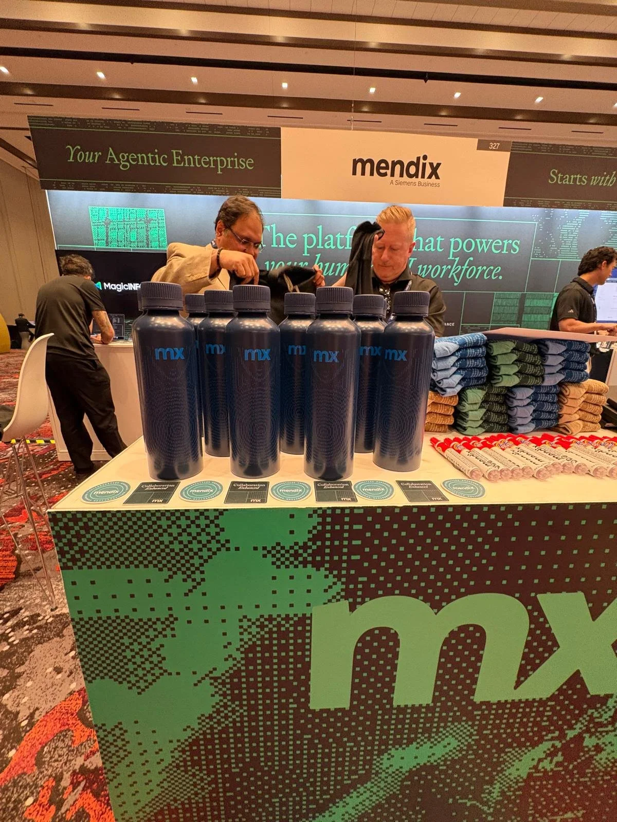
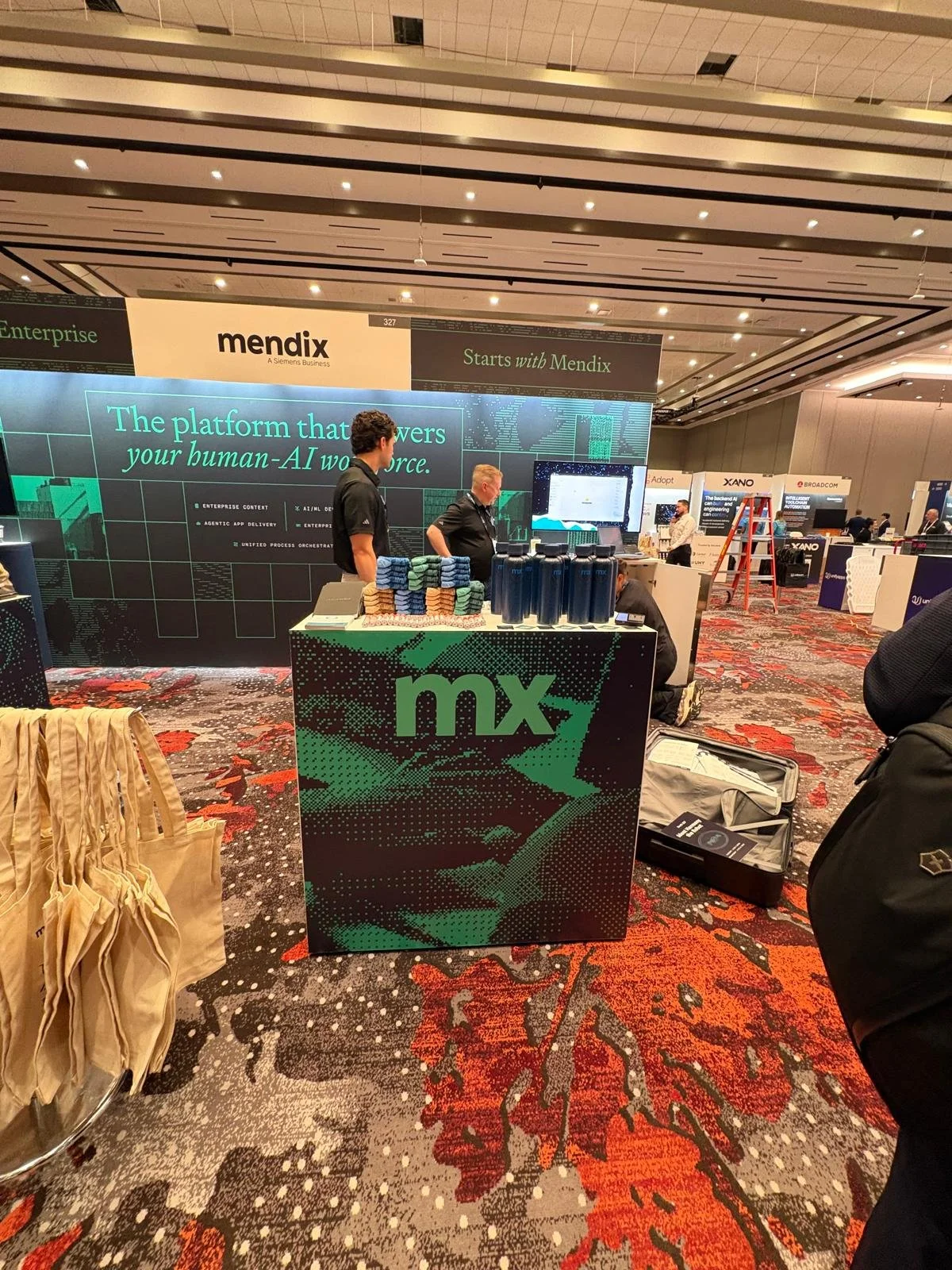
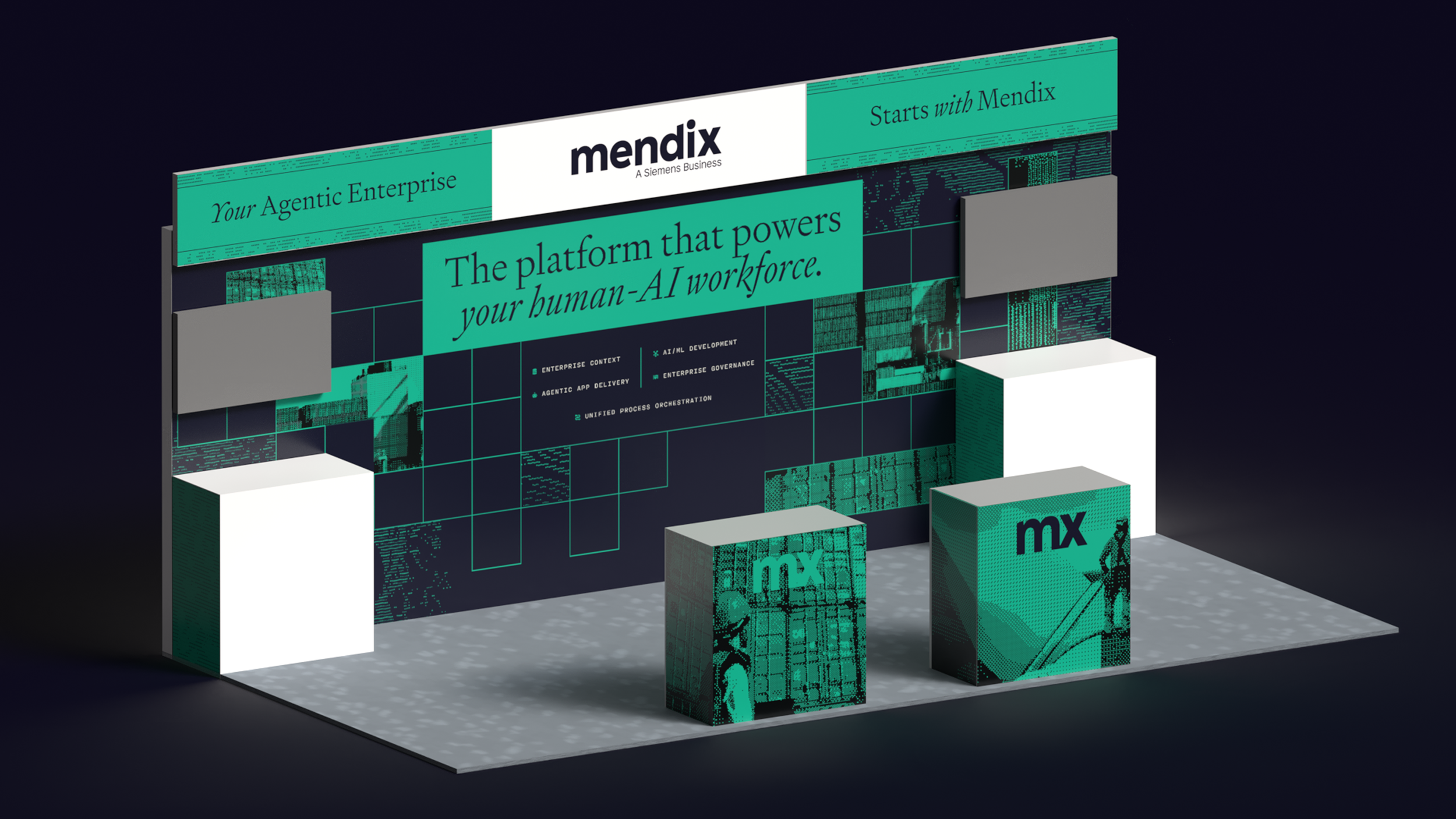
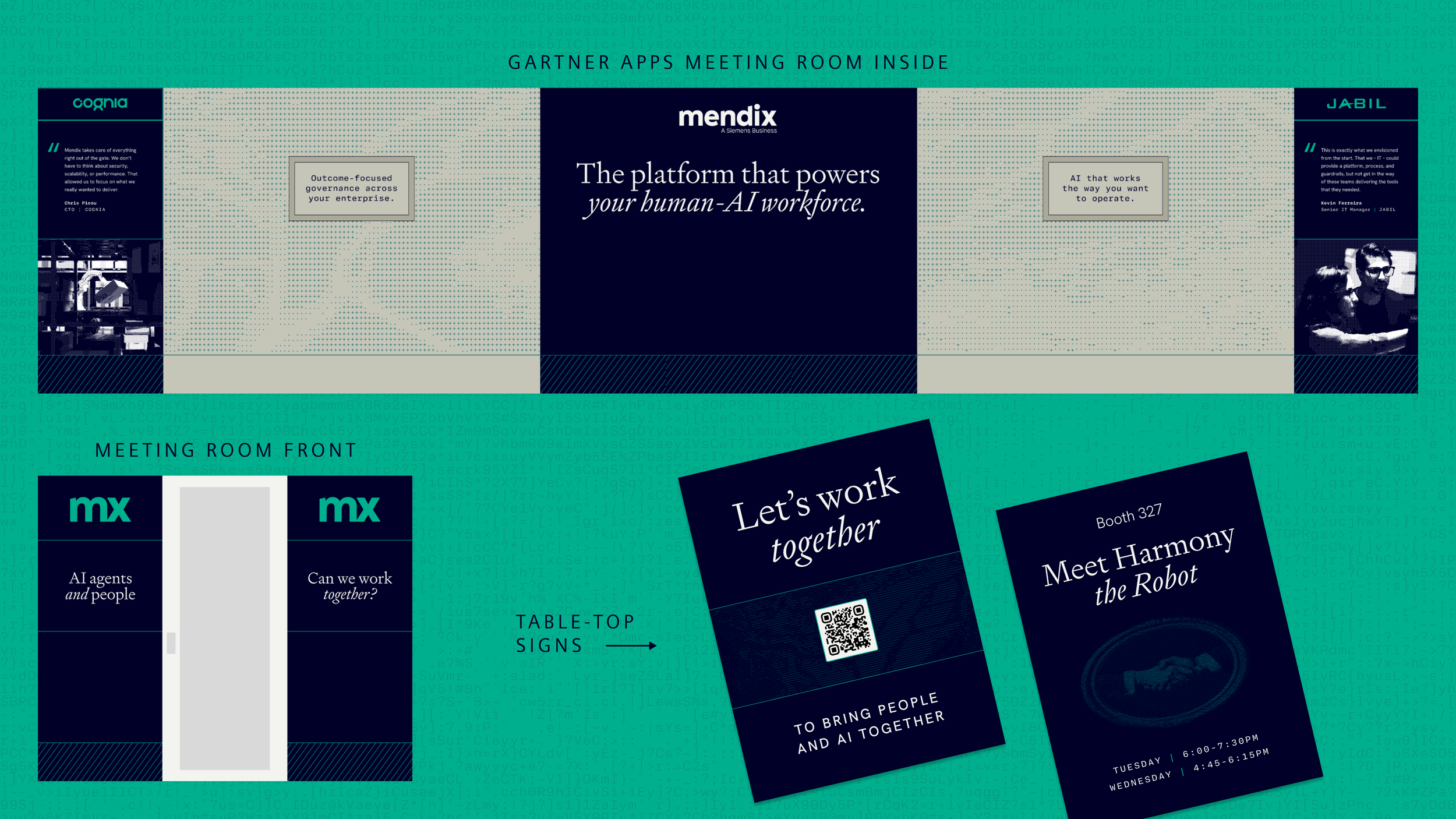
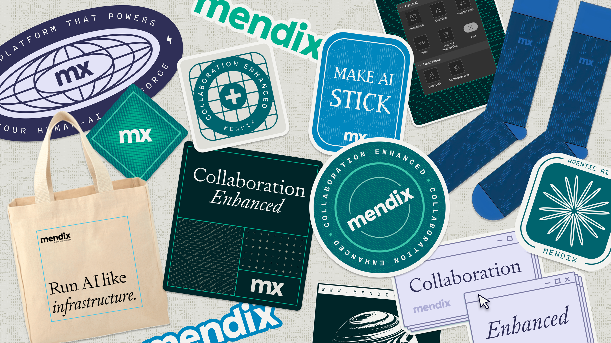
DESIGN IN ACTION: EVENTS & PRINTAcross events, we translated the system into physical spaces—using scale, structure, and typography to make the brand feel as engineered and confident in the room as it did online.
TLDR;